How does screen reading affect typographic choices?
Less and less.
Over the last 30 years, the quintessential problem of digital typography has been how to make fonts look good not only on high-end publishing equipment, but also coarser devices like laser printers and personal-computer screens.
These days, the hardware differences between these devices have largely disappeared. Thus, with screens becoming more paper-like than ever, there’s declining need to make special accommodations for screen reading.
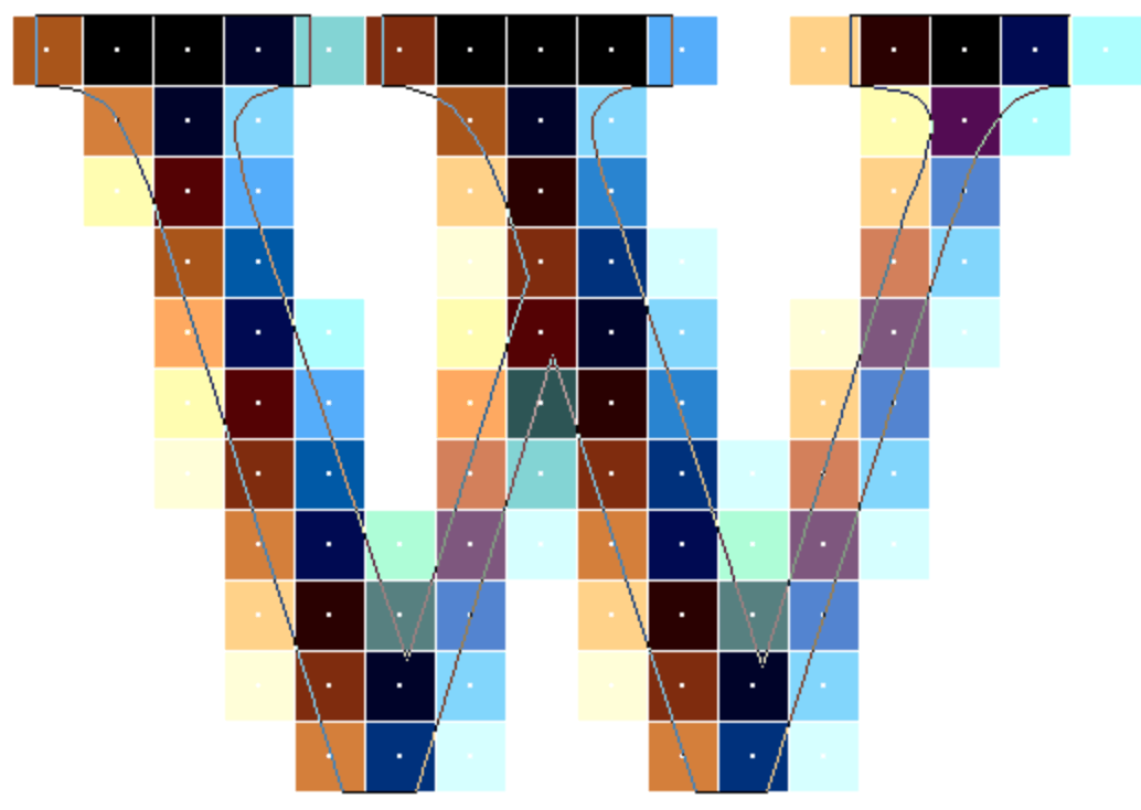
Whether it’s displayed on screen or printed, the computer draws a digital letterform the same way: by scaling a glyph shape to a certain size and activating the pixels that are inside the shape. Thus, the quality of rendered digital type depends on two factors:
The number of pixels available (known as resolution, usually measured in dots per inch)
The number of colors each pixel can display (known as color depth, measured in possible colors per pixel).

But more pixels aren’t always better. At the high end, all reading is constrained by the physiology of the human eye. The eye’s limit of perceivable detail is usually estimated to be 1–2 arcminutes. (An
Because this limit is an angular measure, perceivable detail varies in direct proportion to reading distance. For instance, my desktop monitor is about 24″ away, which means I can see about 143 dots per inch. But on a tablet or phone held at 12″, I can see twice that, or 286 dots per inch (which becomes four times as many pixels per unit of area).
For the first 20 years of digital typography, computer screens barely improved. They were stuck—yuck—in the range of 75 dots per inch. During that time, companies like Apple, Microsoft, and Adobe developed technologies that were meant to make digital fonts look better on screen. During the desktop-publishing era of the late ’80s, the big jump was from bitmap fonts (which only look good at one certain size) to outline fonts (which can be scaled to any size). Still, screen typography was mostly an afterthought.
The project of improving screen type became more urgent with the advent of the web. Some of the best-known fonts emerging from these efforts were Microsoft’s Verdana, Georgia, and Calibri, all of which were heavily optimized for screen reading. At the turn of this century, it was true that certain fonts looked better on screen, and others looked better in print. These fonts became the starting point for those designing onscreen typography.
But since 2010, screen hardware has been making up for lost time. High-resolution screens first emerged in smartphones, then spread to tablets, laptops, and now desktops. For instance, my smartphone display has a resolution of 326 dots per inch, and my desktop monitors have a resolution of 185 dots per inch, both of which exceed the limits of human vision. (By the way, if you haven’t upgraded to a 4K desktop monitor, it’s well worth it. See the infinite-pixel screen.)
For font choice, it means you should use whatever font you’d prefer on the printed page. Those traditional
As for page layout, most screens are smaller in height and width than the traditional 8.5″ × 11″ printed page. So if you’re certain that a document will only be read on screen, it could make sense to shrink the page margins and raise the point size to adjust for this difference. But if a document could also be printed—most downloadable PDFs would fall into this category—then it’s best to stick with a print-optimized layout.
The definitive article on this subject is Beat Stamm’s Raster Tragedy, which has been updated steadily since its original release in 1997. Perfect for those still in the hunt for their ultimate font-nerd badge.