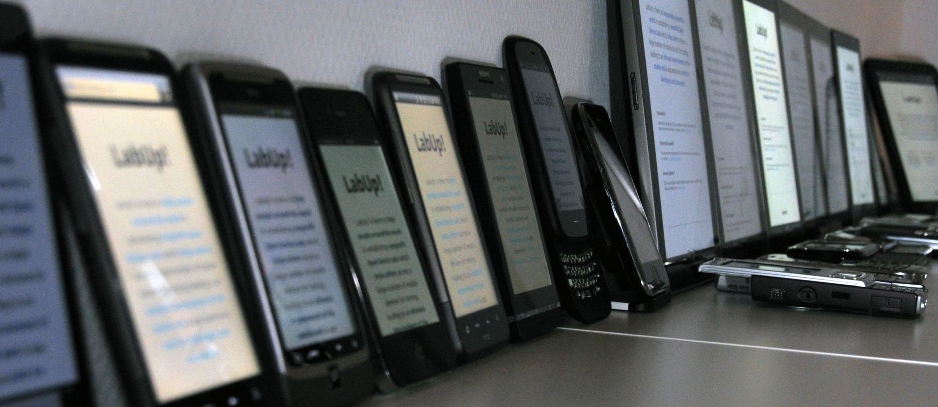
Responsive web design is a technique that allows web layouts to reflow to suit the scale and dimensions of the user’s screen (or viewport, in CSS parlance).
In this way, rather than trying to confect a one-size-fits-all layout, a web designer can specify changes for small screens (e.g. tall-format mobile phones) and large screens (e.g., wide-format desktop screens), and sizes in between. For instance, responsive design is used on many sites (including this one) to collapse a multi-column layout into a single column for mobile devices.
A reasonable idea, as far as it goes. But in practice, designers hoping to solve their screen-size problem with responsive web design have discovered that they now have two problems.
The main challenge, of course, is getting the typography right. Early in the responsive web era, it was common to see layouts with navigation and images carefully engineered to scale up and down with the screen size. Meanwhile, the body text was largely ignored—set at a fixed point size, and allowed to reflow from edge to edge, regardless of the screen width. Not good.
Therefore, for those embarking on a responsive-design project, one key reminder: the rules of good typography don’t change with screen size.
In page margins, I said that one shouldn’t treat the edges of a piece of paper as the boundaries of the text block. Likewise in responsive web design—the edges of the screen are not the end. Just the beginning.
Start by considering line length, because it’s the hardest to manage in a responsive layout. Regardless of screen width, the optimal line length is still 45-90 characters. As you test your layout, make sure that text elements stay within this range.
The easiest way to maintain consistent line length is by scaling the point size and element width at the same rate. These days, this is especially easy thanks to the
vwunit in CSS, which lets you specify measurements as a fraction of the current viewport width.What about the
chunit in CSS, which supposedly corresponds to character width? Skip it. Contrary to the name, it simply denotes the width of the zero in the font. No, the zero’s width is not a useful proxy for average characters per line.Or, if you want text to reflow inside a layout element, include a
max-widthCSS property on that element to ensure that the line length is bounded. As above, thevwunit is your friend.Be careful tying mobile layouts to CSS media queries based on pixel width. As mobile phones have gotten bigger, many sites are setting this threshold higher. (I’ve seen it as high as 1400 pixels.) The problem is that this causes the mobile layout to show up even in reasonably sized desktop browser windows.
Unfortunately, CSS media queries can’t distinguish desktop from mobile devices. If you really want to serve a mobile layout to large mobile devices, consider using JavaScript rather than media queries to detect mobile vs. desktop and load an appropriate stylesheet.
This last suggestion will cause certain responsive-design purists to squeal in horror. But due to differences in reading distance, a pixel on a desktop display and a pixel on a mobile screen are not the same. See screen-reading considerations.
Starting in 2004, a number of web designers proposed the idea of responsive web design, including Cameron Adams and Marc van den Dobbelsteen (who dubbed the technique
“Switchy McLayout”). But the technique didn’t take off until around 2010, when browser support for CSS media queries—the key mechanism for specifying layout changes—became widespread.On this site, I use JavaScript to serve different weights of the body-text font to devices based on their typical rasterization characteristics. For instance, Windows users get a slightly heavier version than Mac users, to account for lighter screen rasterization.