As a law student, I went on a few job interviews. At one, the interviewer’s first comment was
I got the job. There were surely better-qualified candidates. But they damaged their chances with sloppy résumés. The irony is that those people, who most needed to hear the interviewer’s feedback, weren’t in the room. Because they never got an interview.
Consider yourself warned.
This is a book on typography, not typos. But the point is the same—faced with a stack of nearly identical résumés and limited time, readers will make judgments that aren’t based on substance. Whether you think that’s fair is irrelevant. It happens all the time.
The biggest problem I see with résumés is that they’re uncomfortably dense with text. I take this to be the influence of the myth that a résumé can only be one page long. Unless a potential employer demands one page, feel free to make your résumé longer, if necessary. This will ease your typographic problems.
Three caveats, however:
Never assume a reader will get past the first page. Always put the most important information on page one.
When I say
“longer, if necessary”, remember you’re writing for a potential employer, not your mom. My résumé fits on two pages. I’ll bet yours can too.Students, this advice doesn’t apply to you. You’ve only got one page of material. Really.
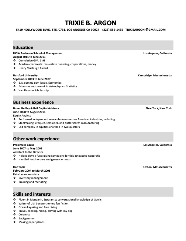
Page margins too small; line length too big.
Body text set in a system font (Calibri).
Headings and gray boxes are too large relative to body text.
Key information—the where and when—is buried.
Ugly bulleted lists.

Page margins bigger; line length smaller.
Calibri replaced with Equity and Concourse.
Headings no longer dominate the page.
Names of schools and employers are easily noticed.
Gentler list bullets.
Nonessential information moved to second page.
Keep in mind that one way a résumé illustrates your virtues is by drawing connections between you—whom the reader knows nothing about—and various schools and employers, which the reader may have heard of. The implied syllogism goes like this: Boxer Bedley & Ball is an elite employer. This person worked at Boxer Bedley & Ball. Therefore, this person is an elite-quality candidate. Don’t make your reader struggle to dig out the names of those schools and employers—make sure they’re immediately visible.
In this revision, the visual emphasis has shifted from the headings—who cares about résumé headings?—to the substance. This also makes the résumé more skimmable, which is always a good thing.
I treat a résumé as a special kind of letterhead. Review those production tips.
Past that, resist the urge to buy paper specially marketed for résumés—the kinds that come in odd colors (e.g., green, pink, gray) or textures (e.g., parchment, marble, linen). High-quality business-letterhead paper from the stationery store works best. Anything more elaborate looks overbaked.
Increasingly, employers and recruiters are asking for résumés in PDF format. In PDF, good typography survives; good paper is irrelevant.
Résumé is the original spelling and still preferred. Resumé is acceptable. Resume is common but wrong. How do you type the é character? See common accented characters.
Nothing beats having another person—or even better, more than one—edit your résumé. But insist that each reviewer propose at least three edits, so they don’t return with the chipper-but-useless
“Looks great to me!”If you’re applying for a design job, it’s entirely fair that you be judged in part by the typography of your résumé. While this seems self-evident, I still see an astonishing number of design résumés set in system fonts. Confidential to all of you: enough already.