Not everything on a page is equally important. As I mentioned in maxims of page layout, I think of documents as having a foreground, containing the most important elements, and a background, containing everything else. Typography communicates this distinction to the reader visually.
For instance, picture a sheet of letterhead. What’s in the foreground? If you said
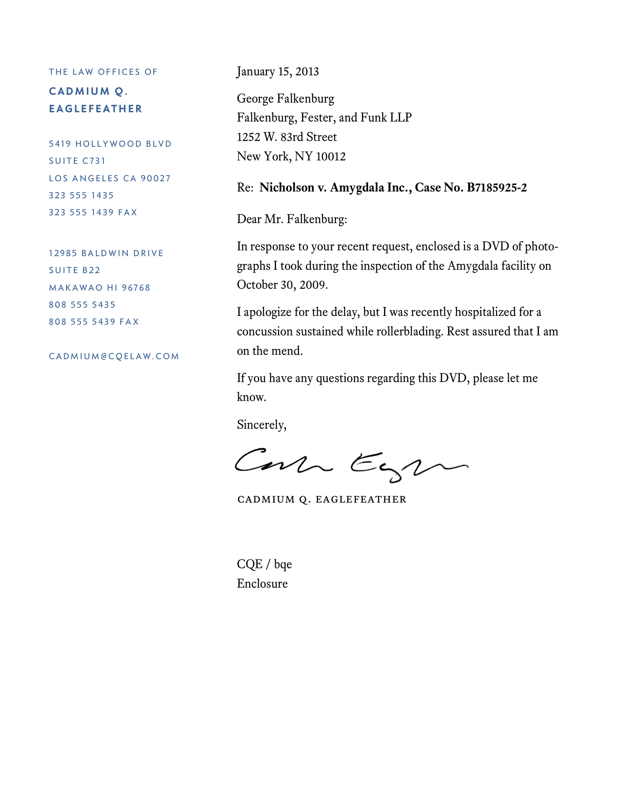
Yet letterhead often suffers from two problems. First, the address block (the background) dominates the page, upstaging the text of the letter (the foreground). Second, the foreground and background don’t relate to each other visually.

Body text in danger of being crushed by massive address block.
Line length too wide; page margins too small.
First-line indents and space between paragraphs needlessly used together.
Screen-oriented system font (Verdana) used for a printed document.
Too much centered text.
Too much space wasted in top margin.
Generally pompous and overbaked.
This letterhead can be improved by making the text of the letter more prominent, reducing the weight of the address block, and making the overall layout less disjointed.
Address block & body text set in more legible, appropriate fonts (Concourse and Equity).
Body text visually occupies more space than the address block, reinforcing foreground–background relationship.
Letter starts at top of page.
Simpler, cleaner two-column layout.
No centered text.
Pomposity eliminated.
The finest letterhead comes from
Next up are
Many offset printers offer graphic-design services as a convenience to their customers, much the same way that bowling alleys rent shoes. These design services are usually fine unless you want the finished work to contain more than a modicum of originality or finesse. In that case, hire an independent graphic designer. (More on that below.)
What about internet offset printers? (Meaning, websites where you upload a PDF, which is then printed and shipped back to you in a week or so.) I’ve been pleasantly surprised by the quality of their work. I can recommend them for jobs where you need a small print run (e.g., less than 500 pieces) but a custom offset-printing job wouldn’t be economical. (Internet printers are also good for business cards.)
But internet printers keep their prices low by combining multiple print jobs into one. This means your paper choices are limited. Also, every print job is done in
The cheapest option is to make letterhead yourself with your laser printer. If you think that would be anathema to a typography snob like me, think again. In fact, I’m not ashamed to admit it—I only use laser-printed letterhead.
Why? I never mail a letter if an email or PDF will suffice. I use so little letterhead that it’s never been economical to have it professionally printed. I imagine that describes an increasing number of self-employed people. So for them, some tips.
Laser-printed letterhead often looks flat and cheap. Therefore, you must overcome the three telltale signs of laser-printed letterhead.
The typography is terrible. That’s been covered above—take the same care with your letterhead typography that you would if you were going to spend $5,000 printing it. In particular, don’t use system fonts—a telltale sign of corner-cutting. With the money you’re saving on printing, get something from font recommendations instead.
It’s printed on basic white printer paper. Splurge on some deluxe paper at your local specialty-paper store. (I use Crane’s Crest cotton paper. It’s not cheap.) Get off-white or ivory paper—pure white tends to highlight flaws in the laser printing. Choose
wove paper, which is smooth, rather thanlaid paper, which has a varied texture. Laser toner affixes better to a smooth surface. (More about this in printers and paper.)The name and address are printed in black. Compared to black printing ink, black laser toner has a characteristic luster and is usually closer to dark gray than black. Heighten the illusion by printing the name and address in a color—something pale and noncontroversial. Color laser printers also use process color, so run tests to make sure the color you pick doesn’t have a gritty dot pattern. Grayish-blue tones often work well.
Yes, you can hire a designer to make your letterhead. See how to work with a designer.