This year’s slate of 11 Republican candidates for president seems like an amuse-bouche compared to 2020, when there were 27 Democratic candidates.
To reveal one of my most contrarian opinions: I’ve never understood the recurring critique of American presidential politics that we have too many candidates. (Sample alarmist think-piece headline:
Even more confusing is the quadrennial hand-wringing about so-called
Largely, however, I think these theories are promoted by political journalists as a means of protecting their own hoary narratives of presidential politics. Here’s mine: It’s chaotic. It’s weird. Nobody knows anything. Thus, evaluating the candidates through the design & typography of their campaign websites is as valid a method as any. If you think otherwise, you’re a typographic spoiler.
The websites of the 2020 candidates were not miracles of originality. Though even compared to that middling standard, the 2024 candidates have converged even more forcefully around a small set of typography, color, and navigation choices.
As for color—though the designers of the US flag realized that red and blue have poor contrast and thus shouldn’t overlap each other, presidential candidates continue to struggle with this unavoidable optical reality.
I recognize that the point of these websites is 1) to raise money and 2) … huh? what? Still, I’m mystified by the complete lack of interest in distilling the candidate’s pitch to any kind of concrete argument. In an election, isn’t the major question
Until then, however, these are your choices.
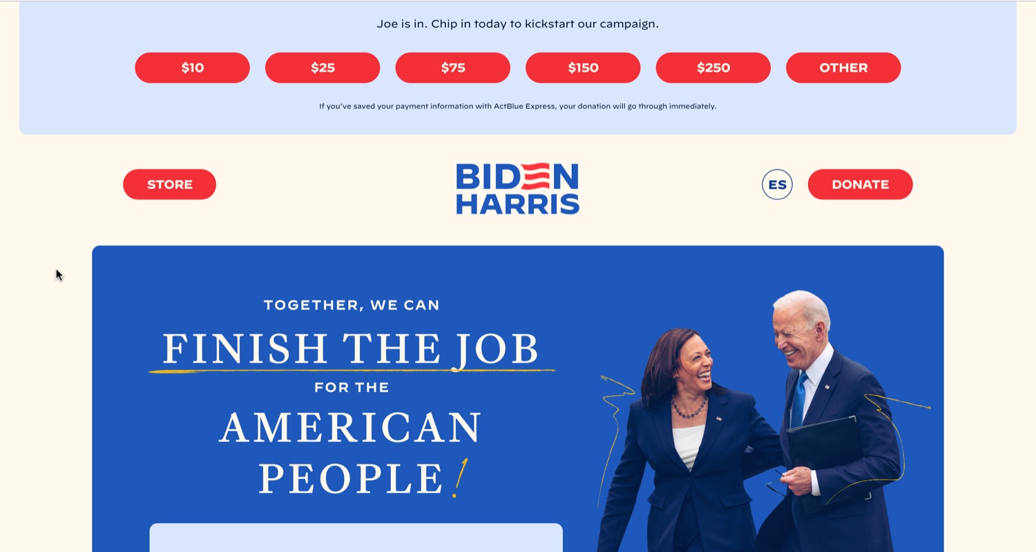
Biden’s reelection site is largely a step down from his very good 2020 effort. The fonts have been upgraded to the excellent Decimal and the Caslon-inspired Frame. Otherwise, however, it’s just weird: the cream-colored background, the Mortal Kombat-inspired tagline finish the job, the scribbles on the page purporting to be Joe’s handwriting, and new wavy stripes in the Biden wordmark reminiscent of Andrew Yang’s baconesque 2020 logo. A quintessential example of what happens in design projects when a large budget is handed over to a large committee: by trying to be everything to everyone, it avoids being anything to anyone.
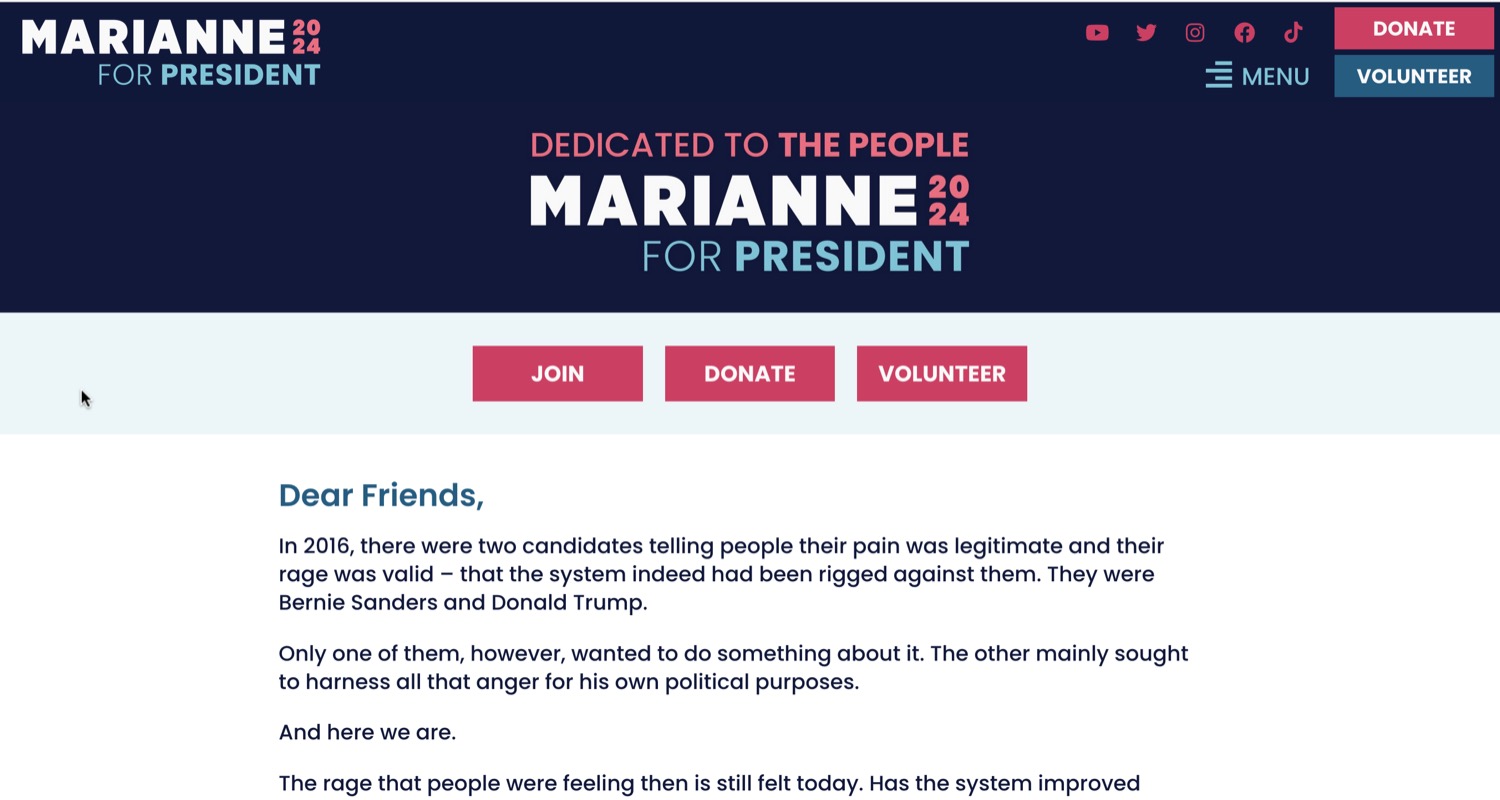
A perplexing entry for those hoping that Williamson’s return to presidential politics would be even wilder than 2020’s. Williamson’s website is devoid of visual interest, even compared to other 2024 candidates—and a major step down from the arty self-portrait she relied on last time. If you’re Marianne Williamson, why aren’t you swinging for the fences? Acting presidential was never going to be your lane. The fonts are Poppins (which she used in 2020 too) and Faustina.
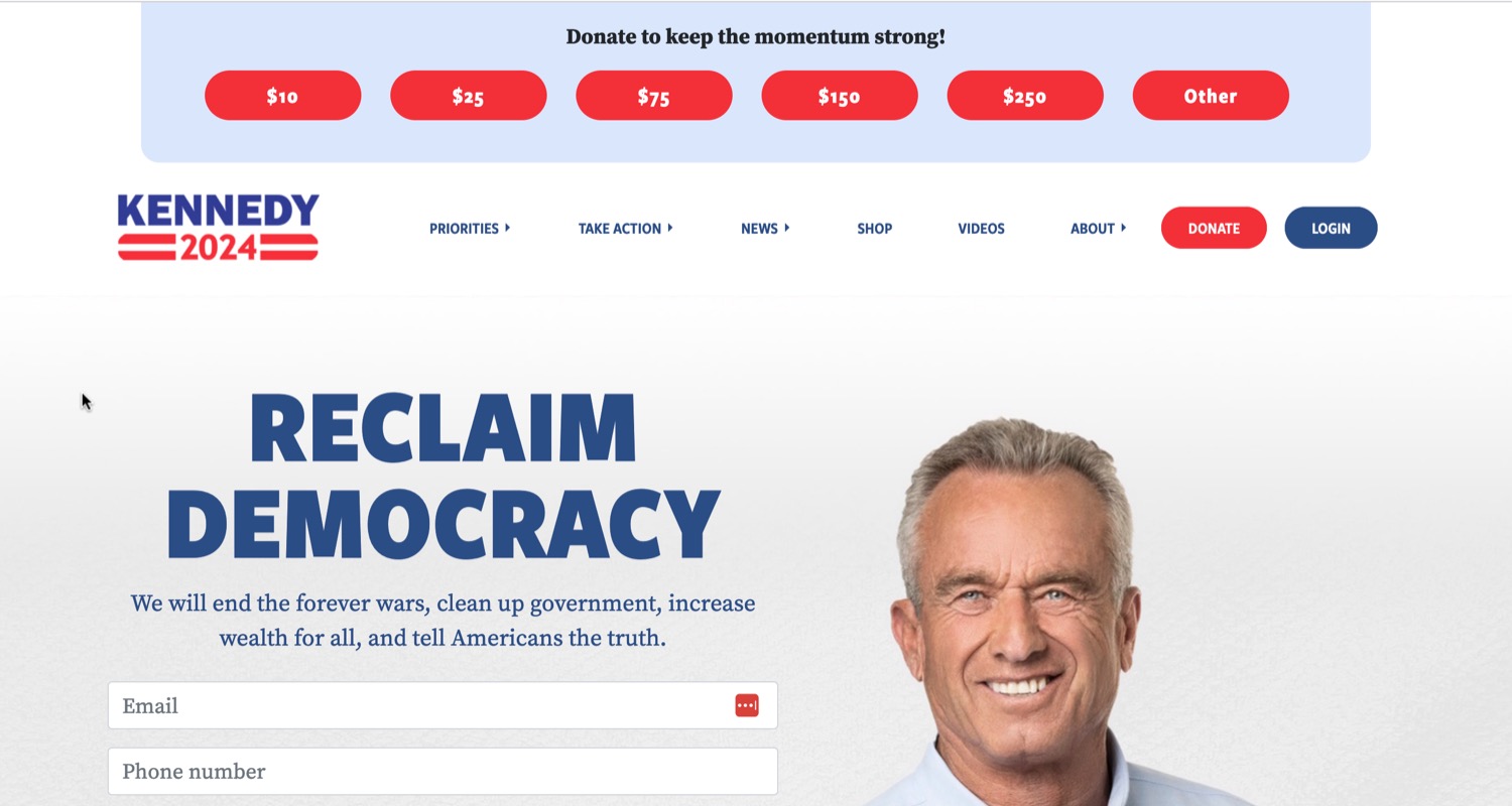
The only good thing about Robert Kennedy’s campaign is the lacerating Curb Your Enthusiasm episode that it will eventually inspire. The fonts are nice—Freight Sans and Source Serif (which I have recommended)—and so far haven’t killed anyone.
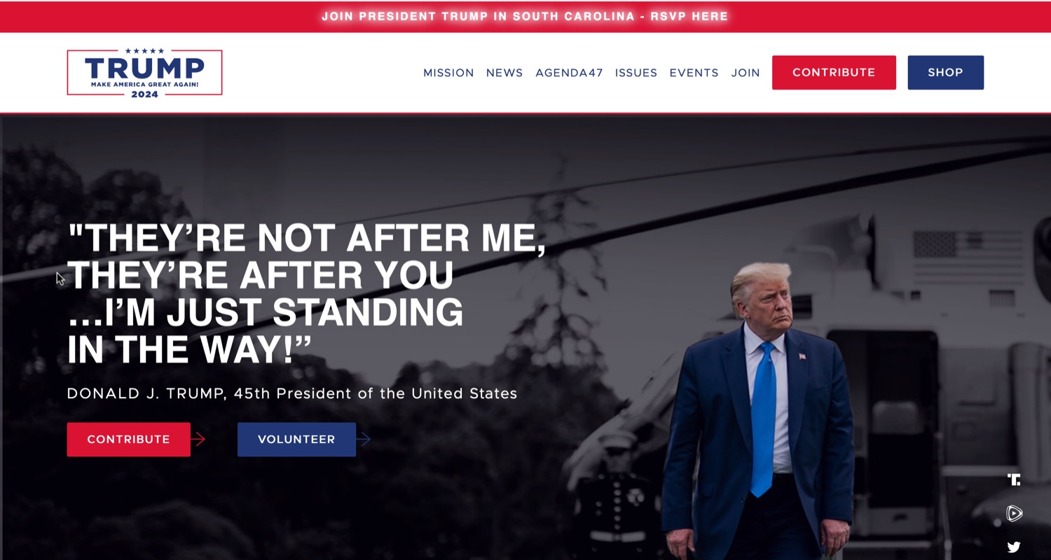
I doubt that any future biography of Donald Trump will note that his 2020 campaign manager, Brad Parscale, started out as his 2016 web designer. Sad! No idea who’s pulling the strings in 2024. Given Trump’s preoccoupation with at-least-basic-cable production values, the shoddy photo editing and other signs of corner-cutting are a surprise. (Given Trump’s legendary vendor-stiffing, maybe not.) According to the web-page markup, the headline font is supposed to be the Gotham knockoff Montserrat, but apparently someone forgot to upload it—or walked off the job before they could—so Helvetica is being displayed instead. The other font is the Gotham knockoff Metropolis. No idea why one Gotham knockoff wouldn’t have sufficed. Or one term.
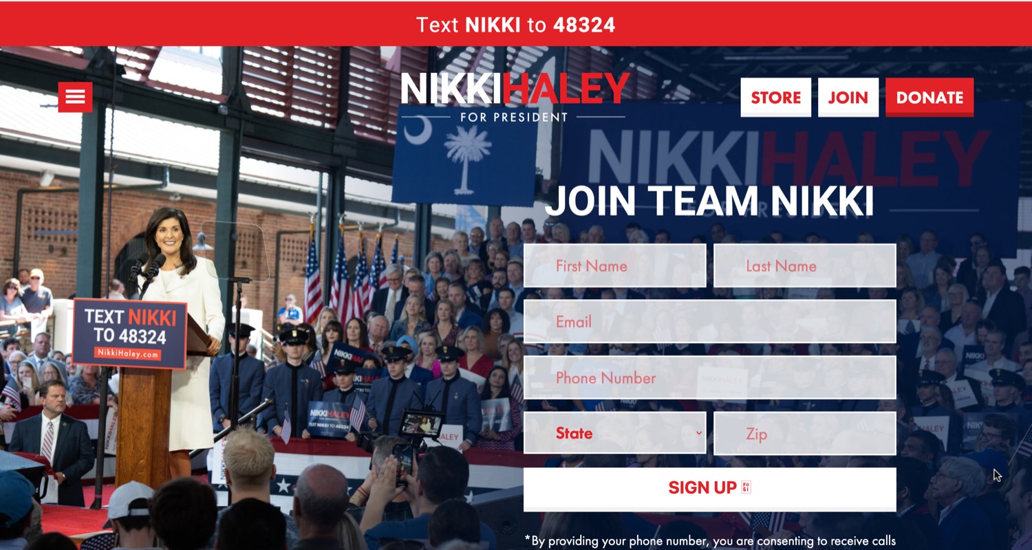
Nikki Haley is currently polling at 4% nationally, yet her home page depicts her as one small face in a crowd. All she’s missing is a Where’s Waldo outfit. I mentioned the red–blue contrast problem—Haley’s logo is hopeless because every time it sits atop blue or gray, the
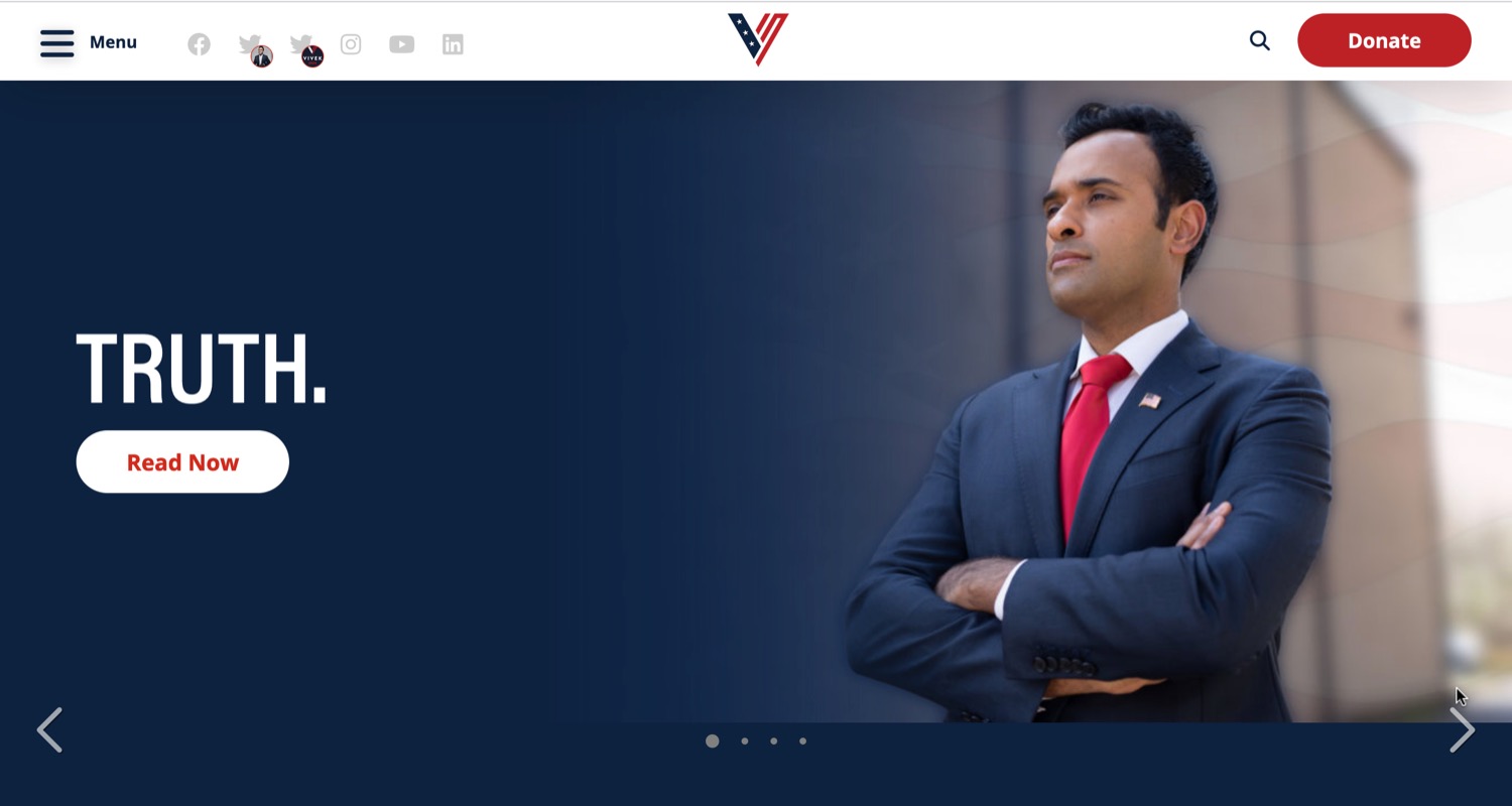
Vivek Ramaswamy is the fictional presidential candidate I would expect to find in a Grand Theft Auto game. Though considering he did pay off a Wikipedia editor, placing his product into a video game might’ve been money better spent. To be fair, I rather like his strange logo, which I choose to read as a secret homage to that of Van Halen. Thus, a missed opportunity to deploy the slogan (A Different Kind of) Truth. The display font is the bland but well-made Acumin; text is the even blander Open Sans.
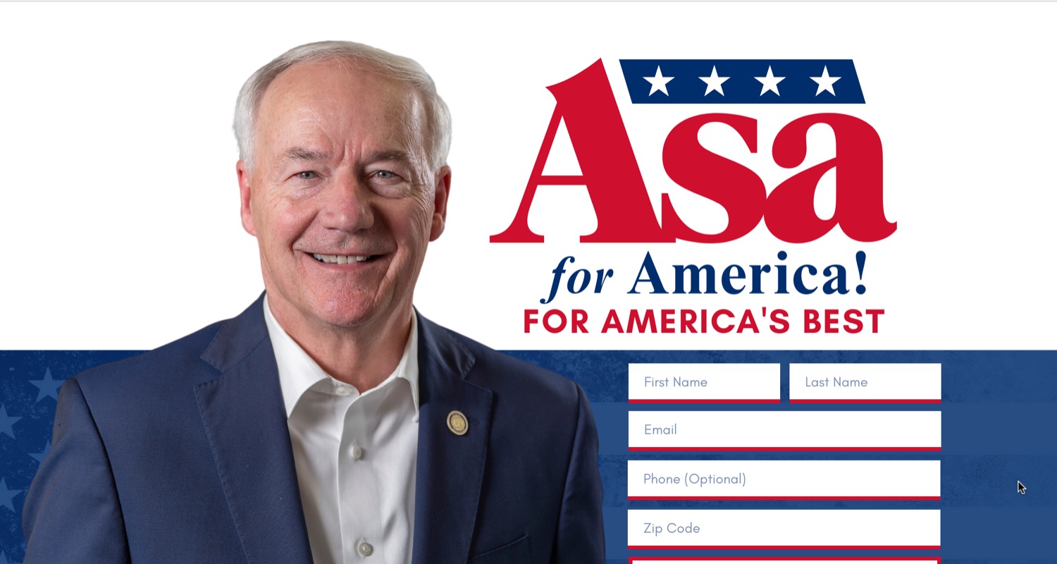
Asa? Wowza. Some candidates want to end America’s forever wars. Hutchinson apparently plans to open a new front against the English language itself. On the other hand, the previous administration wanted us to
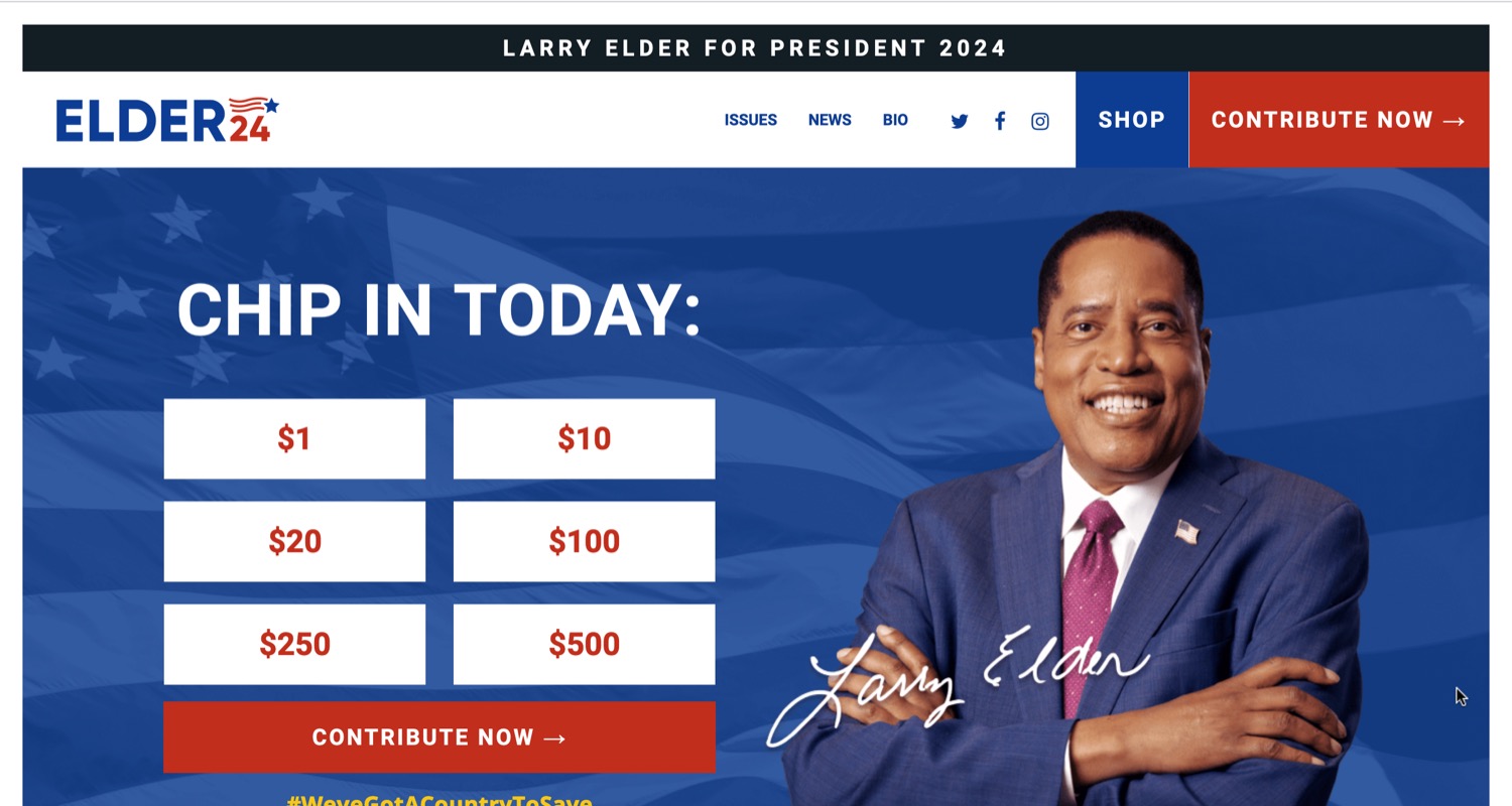
Larry Elder’s site distinguishes itself by not being completely inept. It’s a low bar this year. Like Joe Biden, the stripes in his logo come across as baconesque, or maybe streaks left by a star-shaped sponge on a windshield. (Ron DeSantis shows how to render stripes correctly.) Mostly it’s a problem of scale, however: there’s not enough room in the corner for that kind of detail to be legible. The boring free fonts are Open Sans and Roboto.
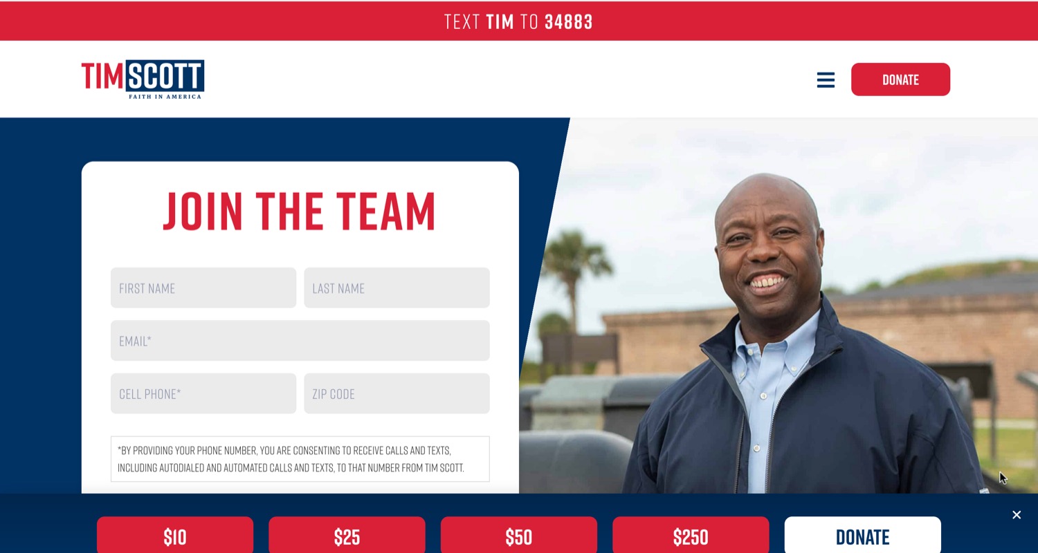
Tim Scott apparently took a break from his vacation to announce that yeah, what the heck—why not run for president? I haven’t ruled out the possibility that he took this photo with a selfie stick. As for the logo, the campaign team apparently said
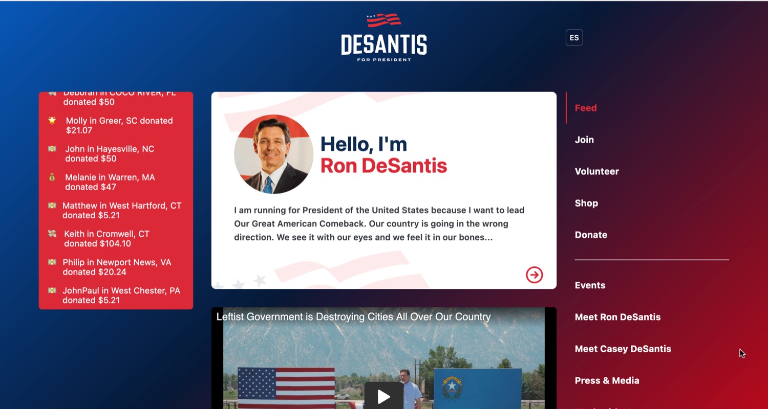
I feel a little bad for Ron DeSantis. Like Nikki Haley, actually being a presidential candidate seems to enchant him less than cosplaying one did. The website looks like the default theme that shipped with WordPress in 2009, with a strange gradient background that blends deep red and blue to make deep sludge. The logo is pinched from Netflix (by way of Pete Buttigieg). The good news: the stripes actually look wavy; the bad news: they cast us into an uncanny valley where the US only has three states, represented by those minuscule stars. Unlike other candidates, the DeSantis website specifies no fonts, instead relying on the system fonts on each device. This is mystifying, yet perfect.
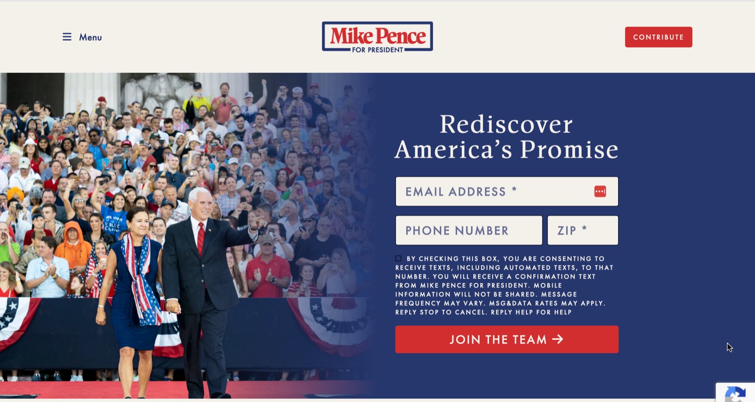
Pence’s capsule biography completely omits everything that happened between January 2017 and January 2021, inclusive. Accentuate the positive, I guess? Pence’s website also omits any mention of where he stands on the issues. Fortunately it does include one of his wedding photos. Pence may want to be careful with the name-in-box logo, a motif similar to that of a candidate whose name Pence would prefer I not mention, but it rhymes with Tronald Dump. Display font is Antonia; text is the Russian-made Futura PT.
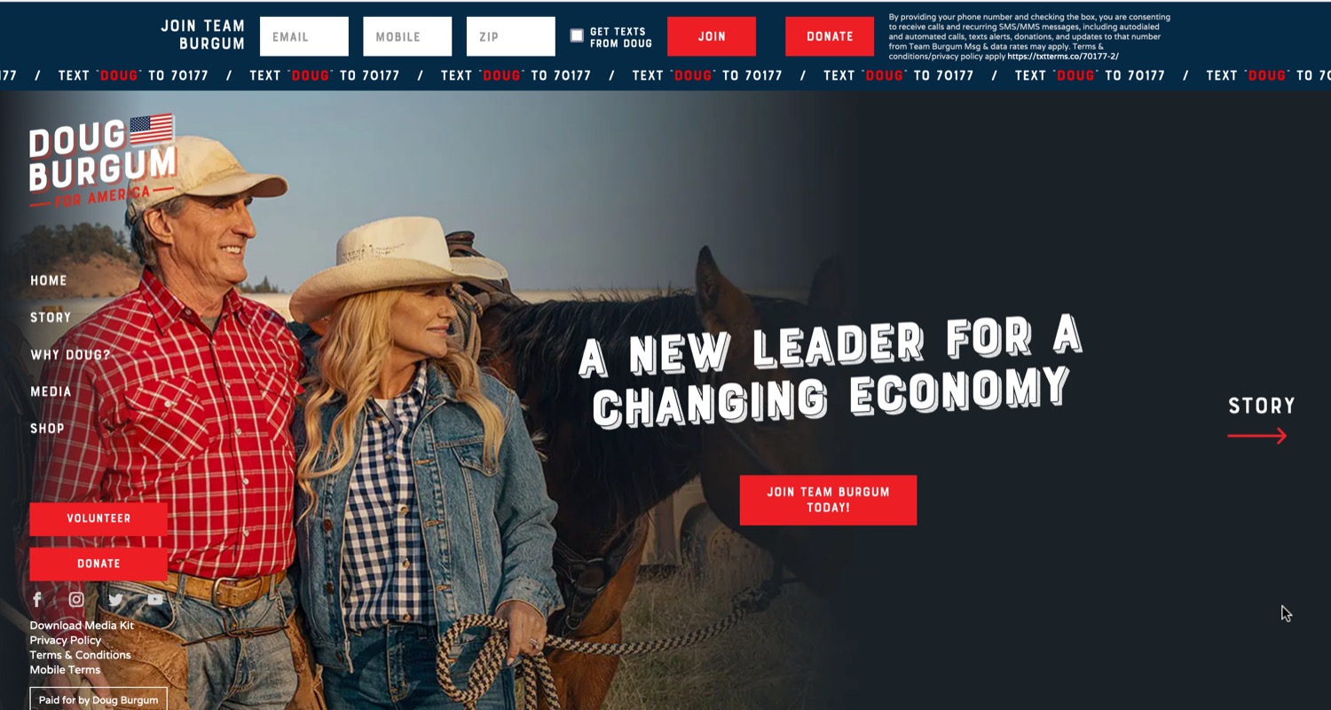
Burgum is a peculiar candidate with a peculiar website. Thousands of copies of the message
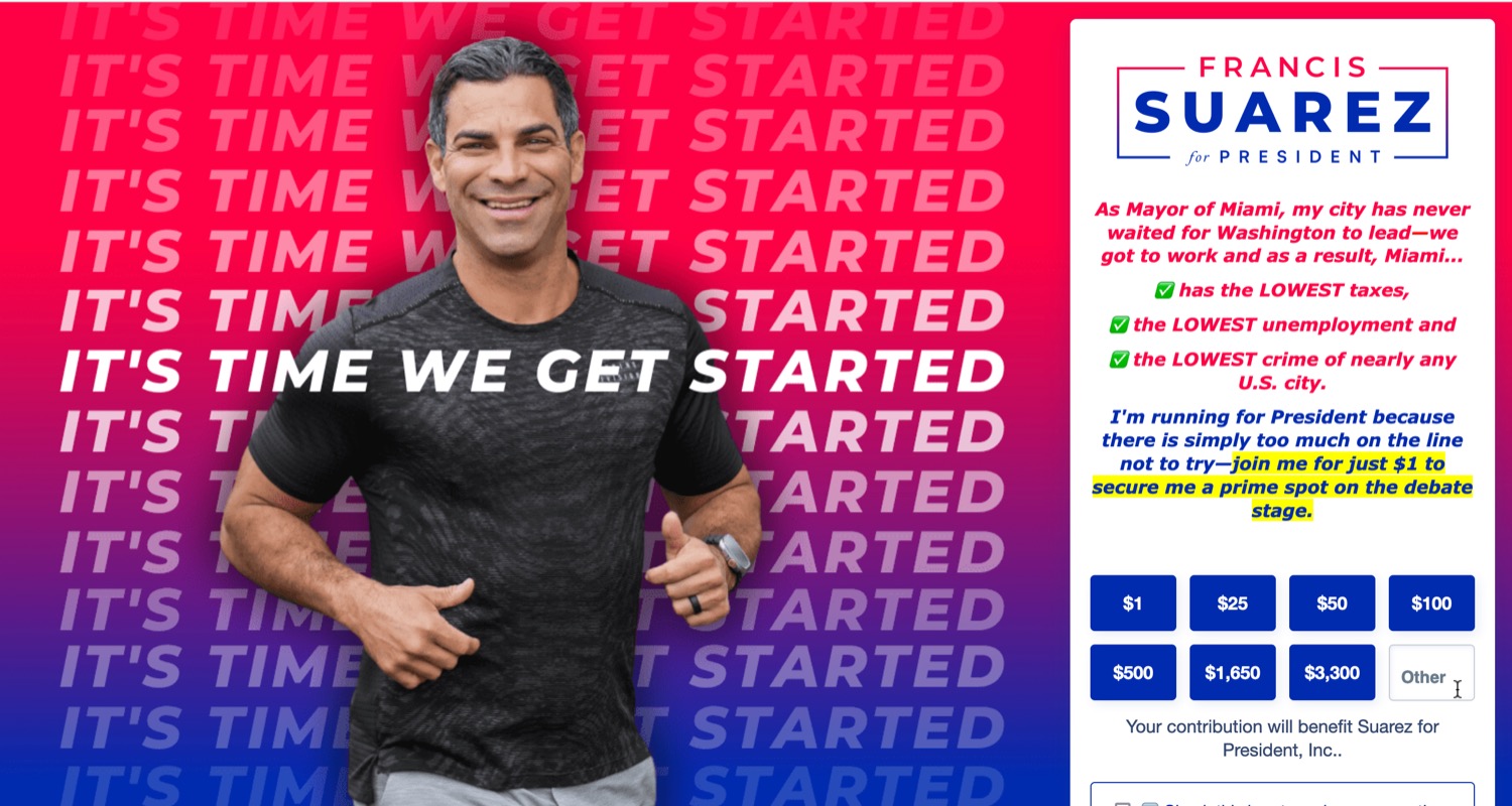
The idea of going jogging with a presidential candidate is not hugely appealing to me. Though Miami mayor Francis Suarez is not the first to try it—see also Wayne Messam, another Floridian who campaigned in 2020. As journalists have noted, Suarez doesn’t actually do much all day except post spicy tweets about cryptocurrency. Which immediately makes him a 2024 frontrunner. Designers for Ron DeSantis take note—this background gradient uses lighter, more saturated colors on the edges so the middle doesn’t get sludgy. Considering this page looks like it took about 25 minutes to make—including a logo concept stolen from Trump—it’s not bad. It remains to be seen, however, what exactly Suarez is going to help us
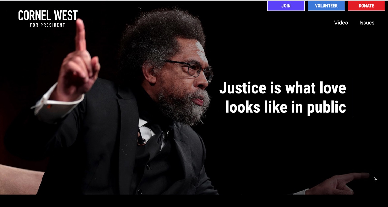
West seems to be channeling the monochromatic stylings of Beto O’Rourke, who lost consecutive races for US Senate, US President, and Texas governor. Interesting model to follow. Still, West is a cool dude and if he gets on a debate stage, I will watch. The blah font is Roboto.
20 June 2023