A special listicle for America
Presidential-campaign typography took a big step up in 2008, when Barack Obama adopted the then-new Gotham font for his campaign. (Though for his re-election campaign, he had serifs added.) This led to the rise of Gotham throughout the United States. But especially in political campaigns, where the geometric sans has become typographic shorthand for #winning.
Interestingly, one of Obama’s few bipartisan successes was inducing Republicans to use Gotham too: in 2016, it was chosen by Ted Cruz and Donald Trump (well, the no-cost Gotham knockoff Montserrat).
Along those lines, should a Joe Biden campaign materialize, the presence of Gotham will be an indicator of how much he plans to run on Obama nostalgia. Anything but Gotham would be a more encouraging sign—someone who’s been around forever should find a way to surprise. Still, I’ll be surprised if I turn out to be surprised. [Update: Joe Biden has entered the race. Without Gotham!]
I wasn’t impressed by any of the websites, none of which exceeded the high end of mediocre—what you might find in an $18/month Squarespace plan.
Of course, there were a ton of Gothamesque geometric sans serifs.
The candidate who was most successful stoking my curiosity with design was Kirsten Gillibrand.
I was surprised that the long-shot candidates weren’t taking more chances with their websites—what the hell have they got to lose? Though I suppose Julián Castro, whose site was as boring as any, was nevertheless the most competent.
Among current front-runner-ish candidates, Kamala Harris was the worst underperformer, with Beto O’Rourke second worst.
Overall best in show: I am surprised to say it’s Joe Biden.
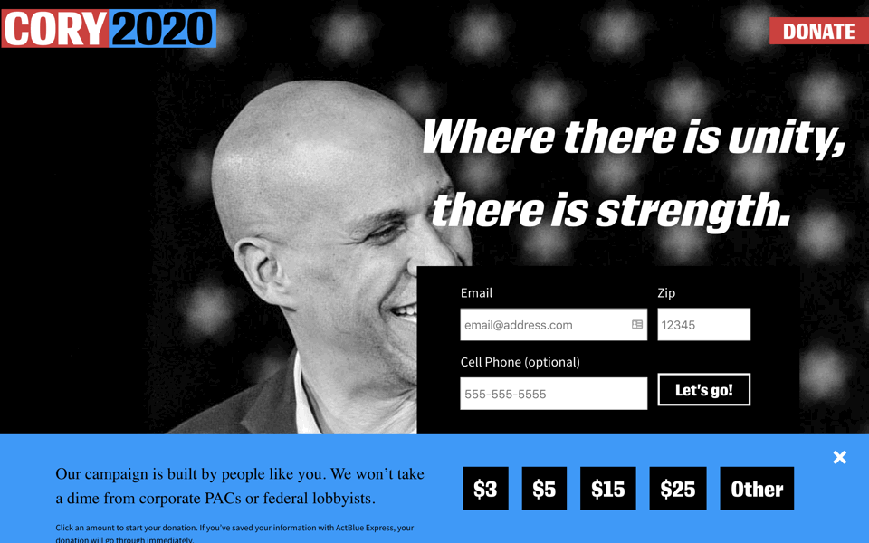
Overall worst in show: Cory Booker, who apparently decided to run for president on a Monday, crowdsourced his website on Tuesday, and launched it on Wednesday. Unbearable.
For those who think it trivializes our political process to judge candidates by their typography—what would you prefer we scrutinize? Qualifications? Ground into dust during the last election. Issues? Be my guest. Whether a candidate will ever fulfill a certain campaign promise about a certain issue is conjectural.
But typography—that’s a real decision candidates have to make today, with real money and real consequences. And if I can’t trust you to pick some reasonable fonts and colors, then why should I trust you with the nuclear codes?
Book publishers spend a lot on cover design. Candidates likewise spend a lot on their public presentation. Why? For the same reasons: voters (or readers) are going to make judgments based on design factors (whether consciously or not). So just as we should feel justified judging a book by its cover—because that’s what it’s for—we should likewise feel justified considering how typography reflects on each candidate.
Along those lines, my pet political theory is that even as they labor to reveal their characteristic strengths through typography, candidates tend to be more successful revealing their characteristic limitations. The evidence is left as a thought experiment for sufficiently motivated readers.
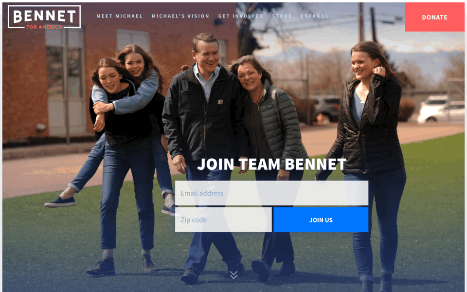
Now that Mighty Joe Biden has entered the race, subsequent candidates are going to have to paddle harder to answer two critical questions: Who are you? and Why are you here? Bennet’s answer seems to be that he has the politics of fellow Coloradan John Hickenlooper, the web design of Eric Swalwell, and in a weirdly flagrant pinch, the arched logo of Pete Buttigieg (combined with some Gotham
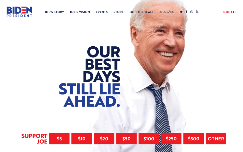
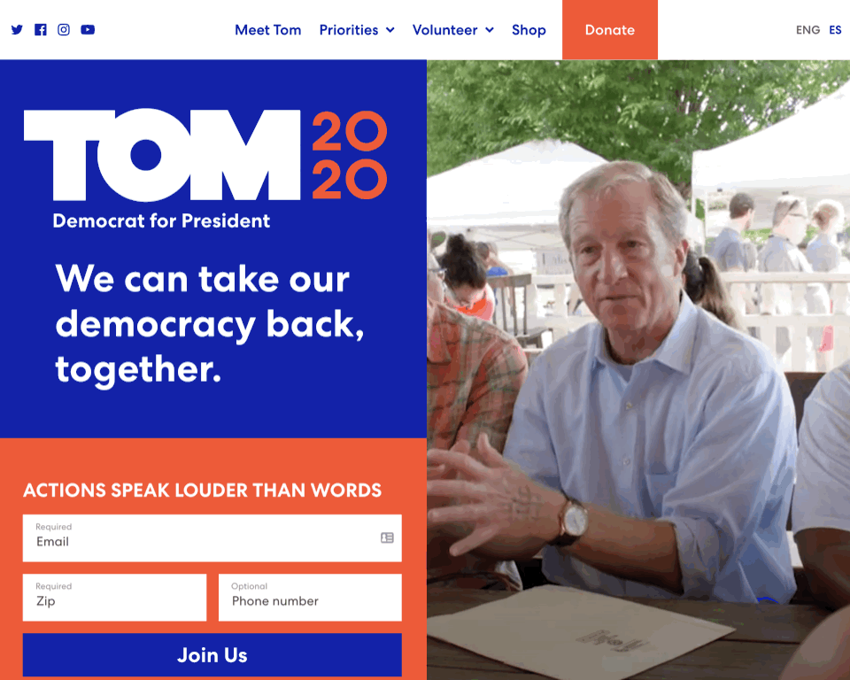
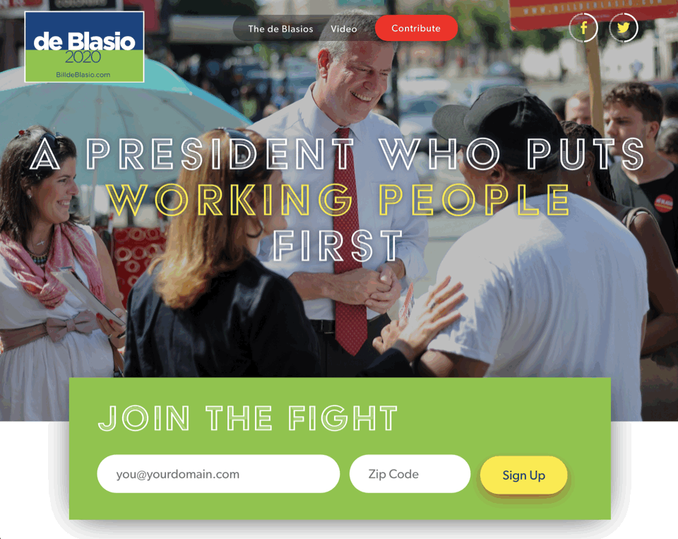
Argh, it would be more fun to hate this. Daring, it’s not. But to give Joe his due—it’s simple, direct, and well done. The design is meant to look relaxed and effortless, but accomplishes that only by being exceedingly specific in its details. For instance, here on the home page, Joe’s tie is coordinated to match the color of the typography. The generous use of white space on every page is both punchy and elegant. Like all the candidates, the font is Gotham-like (in this case, Brother 1816). The red-white-and-blue color scheme is also no surprise, though the use of red is restricted to the wordmark, the donate buttons, and a few other small UI elements. (Tulsi Gabbard overdoes it.) The wordmark tries a little too hard for corporate-logo cleverness, but I like the boss move of putting
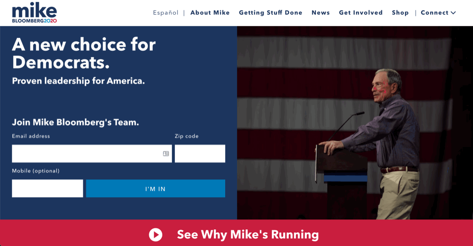
If you thought that Michael Bloomberg has been secretly plotting to jump into this race for years—nah. The proof: everything about his campaign website is slapdash and derivative, like a student who saunters into the final exam 10 minutes before the end and hurriedly cribs what he can from nearby students. The
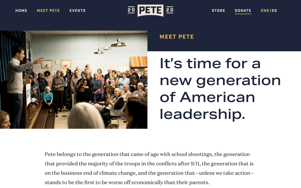
Pete has wisely avoided campaigning on his last name (though as a fellow Butt-prefixed American, I’m a little disappointed). The arched wordmark is a cute idea, though it appears stolen from Netflix. Pete & chill? It could also have been rendered better—the capital Es are stretched awkwardly to fit the space. The splitting of 2020 around the mark is the kind of thing that makes people hate designers. Combined with the navy and gold colors, it’s reminiscent of a sports team, which is a body of typography I’m surprised candidates haven’t relied on more. Display font is Aktiv Grotesk; text is Domaine.
Disclosure: I donated to Pete based on his answer to a question about Ulysses and Finnegans Wake in a recent interview. #winning #revengeofthenerds
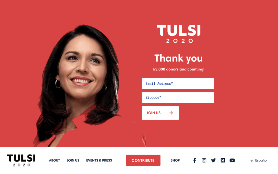
I like the simplicity of the concept. The flat color field is arresting, even if it makes the candidate look like a flight attendant on Tulsi Airlines. I don’t like the take-perfectly-nice-font-and-chop-off-the-corners wordmark, a trend that has been done to death (and if you’re going to bother, why not chop off the L so it can sit closer to the S?) Text is Neue Swift; display is Harmonia Sans.
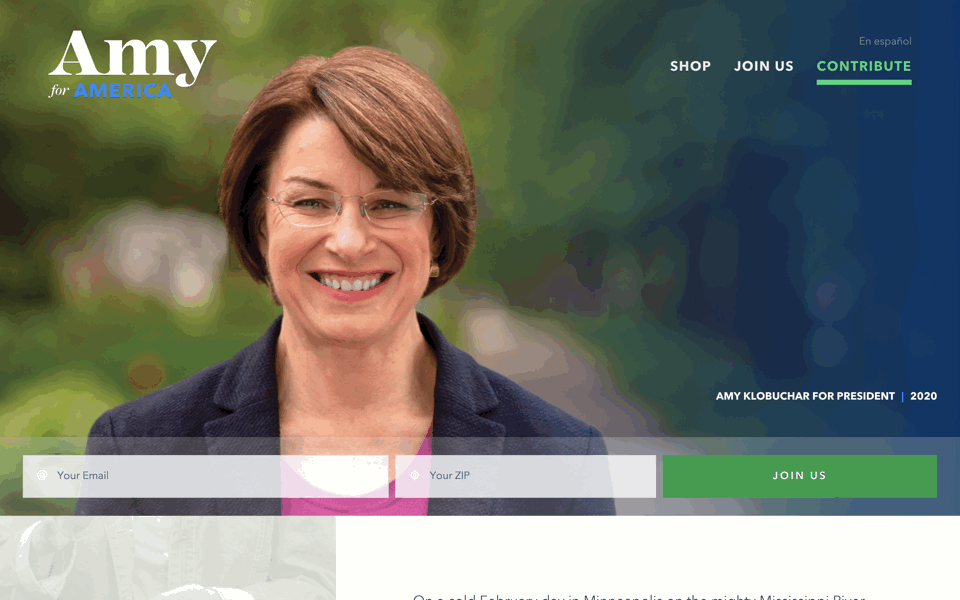
Amy—why are we on a first-name basis with our presidential candidates?—is the only candidate using traditional serifed lettering. Whoa! (I didn’t recognize the font, but internet sleuths tell me it’s Mackay, which I now see is rather interesting, except for the three letters in
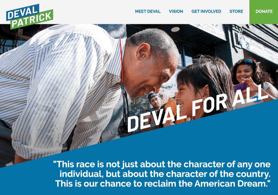
As befits someone who announced his candidacy three seconds ago and hence has no donors, Patrick uses free fonts: the logo and headlines are Barlow, and body text is Raleway. Though watch your back, Amy Klobuchar—Patrick is apparently steering into the blue/green lane you’ve had to yourself thus far. The use of diagonal elements as a motif is plainly the decision of political neophytes who’ve not considered how many rectangular objects a campaign needs to produce.
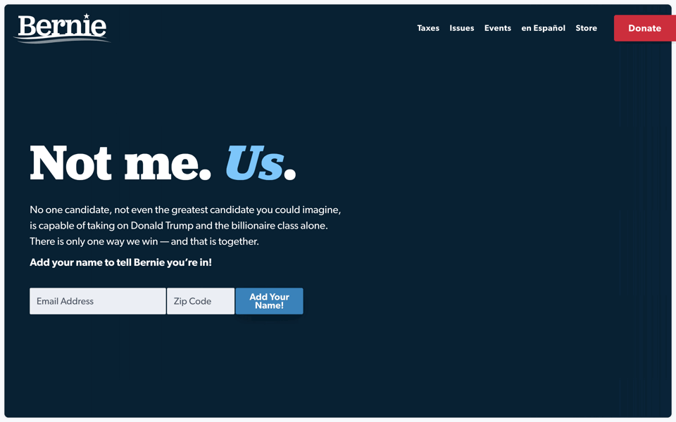
I liked Bernie’s typography in 2016—his use of Jubilat was unexpected but not discomfiting. Sort of like Bernie’s candidacy itself. He seems to be sticking with it for 2020, at the risk of creating a sense of
Disclosure: I donated to Bernie in 2016.
That’s Steyer, spelled with a why. Despite his late entry to the race, Steyer didn’t even have time for an irony review: apparently he wants to get
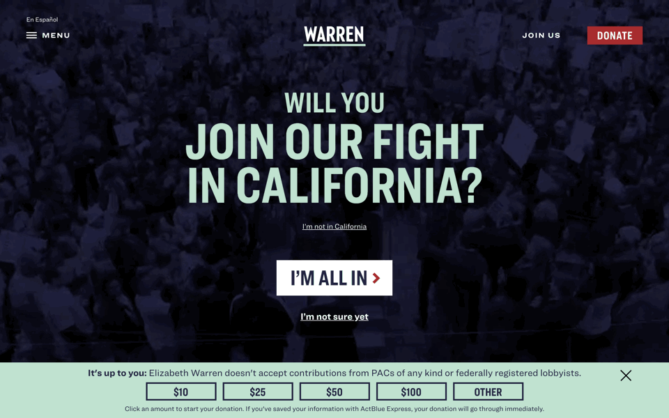
Some good ideas here—a few pay off, most don’t. I like the idea of a candidate’s website as being like an issue of the New York Times magazine—even the
Disclosure: I donated to WARREN.
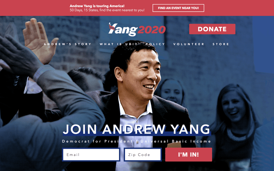
Free advice for those with zero name recognition: don’t design a wordmark (in Halyard, FWIW) that makes it hard to read your name. The Y in Yang looks like—what, a slice of bacon using a playground slide in an unsafe way? Everything about this website confuses me. I can’t tell if Andrew Yang thinks that’s a feature or a bug. Like Amy Klobuchar, Yang also discovered the oh-so-appropriately-named Avenir for text.
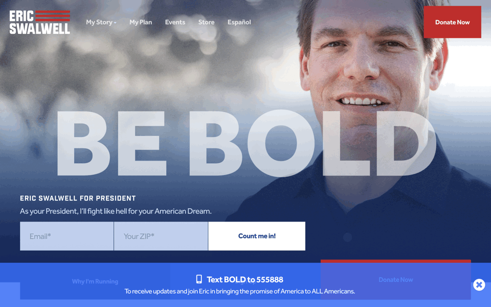
I compliment the wordmark designer for not fumbling the difficult spacing around the two Ws (which would be an ongoing challenge of a Swalwell presidency). Display is Industry Inc, text is the Gothamesque Effra. Colors are red, white, and ... you know. But Swallwell’s website shouts platitudes like
(Dropped out in July 2019.)
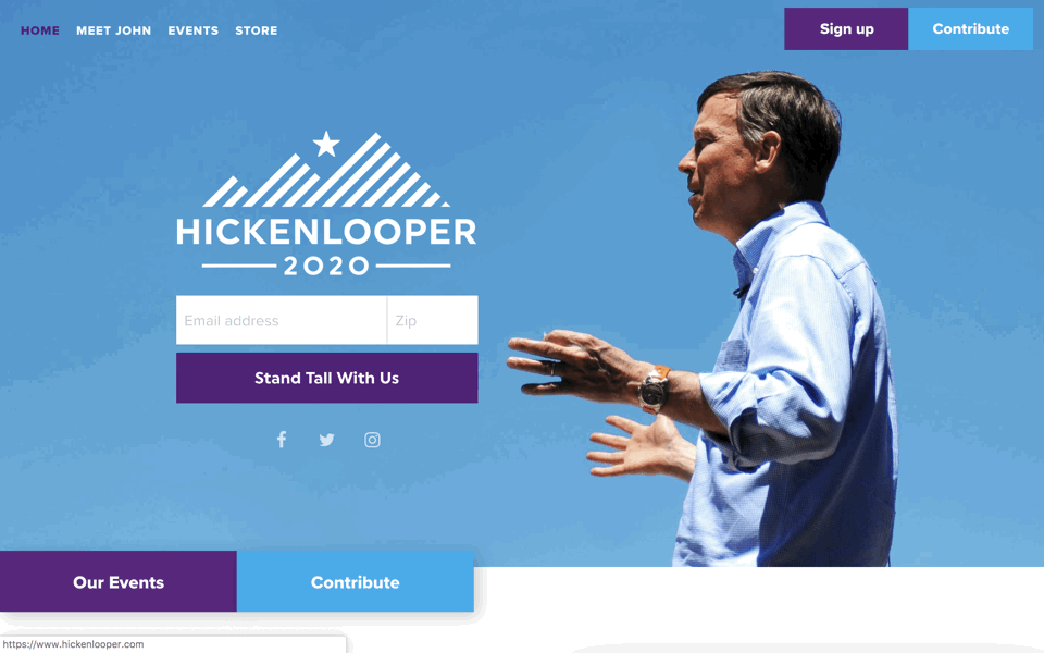
It could be worse. But it still looks more like he’s starting an outdoor-clothing label, not running for president. Like other candidates, Hickenlooper evokes Obama’s use of Gotham (with the similar Proxima Nova, though Proxima predates Gotham). The deep purple is unexpected—Colorado is politically
(Dropped out in August 2019.)
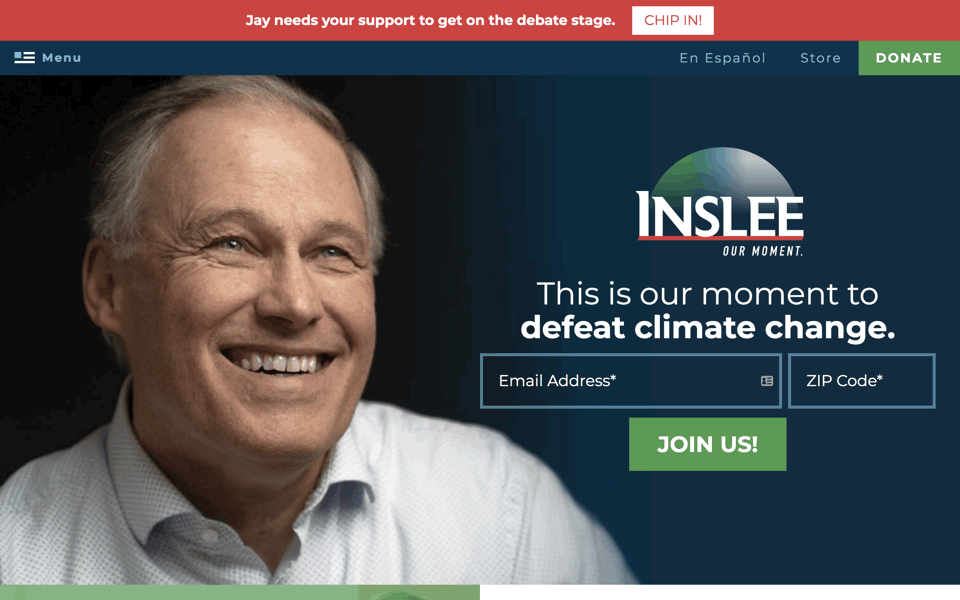
The typography makes it look like a pharmaceutical ad—Ask your doctor if Inslee™ is right for you. Jay Inslee wants to give you lots of colors: American red, white, and blue, and a lighter blue, and then a couple shades of green, I suppose to connote that he cares about the environment. Another candidate evoking Obama’s Gotham typography (this time with Montserrat).
(Dropped out in August 2019.)
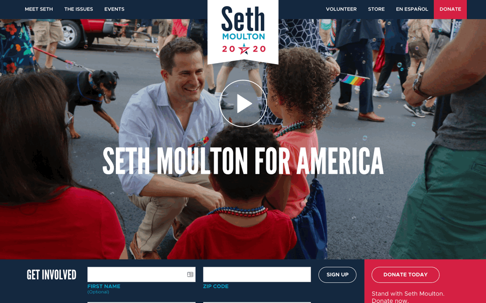
As with fellow late entrant Michael Bennet, Seth Moulton seems like déjà vu all over again. Two shades of blue and one shade of red? Check. Free fonts? Check—League Gothic for display and Metropolis for text. Wait, does one of them look like Gotham? Check. Is he
(Dropped out in August 2019.)
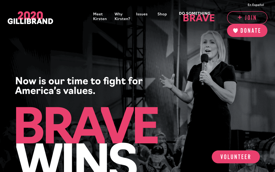
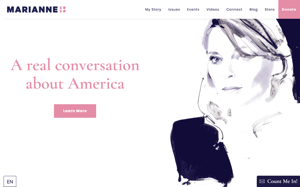
I mostly like this—simple and punchy—with the caveat that the hot-pink color scheme reminded me of a cancer-awareness nonprofit. But Gillibrand’s slogan is
(Dropped out in August 2019.)
The good news: a genuinely novel display face (the two-tone Acier) and a solid sans for text (Gibson, also used by Bernie Sanders). The bad news: everything else. The horrific colors make
(Dropped out in September 2019.)
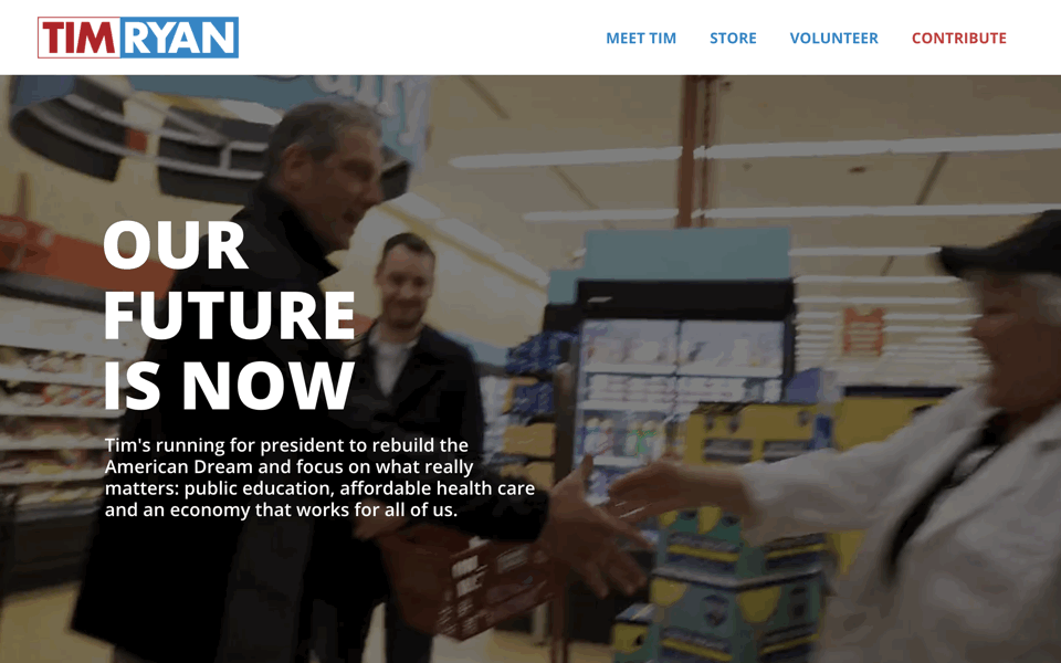
Tim Ryan seems to have gotten his logo and website from the same factory-outlet store as Cory Booker. Ryan has slightly better production values, but seems to consist mostly of photos and videos taken on smartphones. Fonts are nothing special: the freely available Open Sans and Poppins.
(Dropped out in October 2019.)
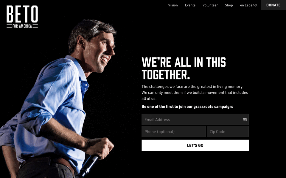
After the Playskool color schemes of the other candidates, Beto O’Rourke’s monochromatic wordmark and website are a good start. Things go downhill from there, however. The website seems like it could’ve been made 15 years ago, with its menus of tiny type linking to pages filled with more tiny type. Display is Prohibition and URW DIN; text is Tisa.
(Dropped out in November 2019.)
Like Jay Inslee, Messam’s website also uses a red–green–blue color scheme with a geometric Gotham-style sans (Montserrat, also favored by the current commander-in-chief). The wordmark is wildly misproportioned, with
(Dropped out in November 2019.)
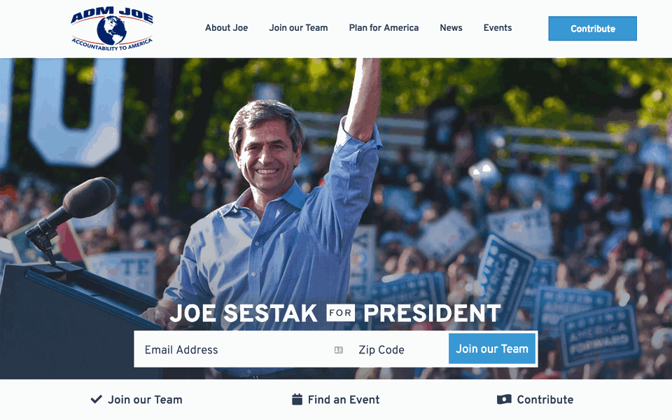
When I first published this piece, I said I was surprised that no candidate had ever used Interstate, which is modeled on the U.S. highway font. In an amazing coincidence, very late entrant Joe Sestak has launched his campaign using Overpass, an open-source family based on the same model. Am I the only one who thinks Sestak looks like he could be Pete Buttigieg’s dad? Other than that, the only place where Sestak is competitive is the race for most peculiar logo, where he might edge out Andrew Yang and Seth Moulton. Sestak’s eyeball-shaped logo looks like it was made with Corel Draw in 1997. Apparently no one noticed that his slogan
(Dropped out in December 2019.)
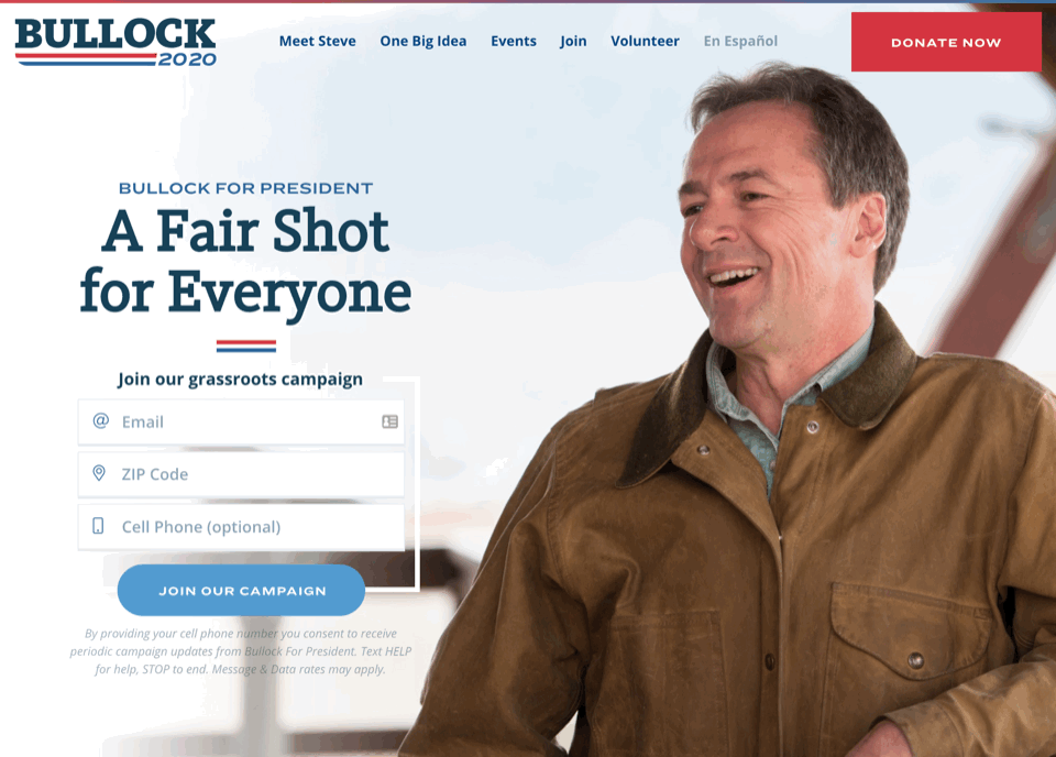
Late entrant Bullock brings something truly new to the campaign season: slab serifs in his logo and headlines (FF Kievit Slab) and a wide sans (Ringside, a font family also used by Elizabeth Warren). Both nice fonts. Text is the unremarkable Open Sans. Otherwise not a lot to distinguish Bullock’s presence—pretty much the same
(Dropped out in December 2019.)
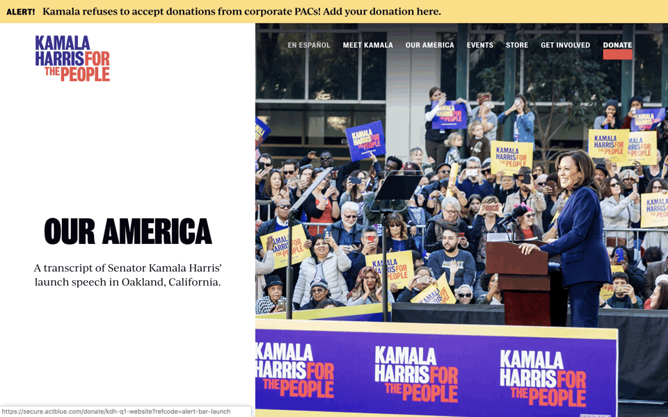
I like the display type a lot (Bureau Grotesque). But lordy, the colors are nauseating. Apparently Kamala intended to pay tribute to the red and yellow colors of 1972 candidate Shirley Chisholm. Fair enough, but something got lost in translation: the red became reddish orange, the intense yellow became goldenrod, and then she threw in bluish purple too. Here in California, the knock on Kamala is that she’s always been eager to be seen as all things to all people.
(Dropped out in December 2019.)
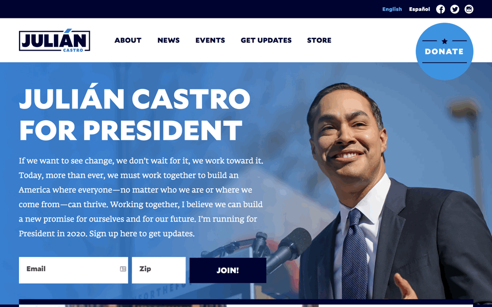
As a layout, not inventive—looks like a middling WordPress theme. But clever in places: for instance, the colorized accent over Á in the wordmark. Also the font choice, which alludes to Gotham by using Mallory, another geometric sans by the same designer, Tobias Frere-Jones. Castro finds a nice balance of headlines that aren’t too big and body text that isn’t too small, with ample white space too. In contrast to his competitors, most of whom favor acres of tiny type, like they were designing for the web of 1996. Text is Fedra.
(Dropped out in January 2020.)
I like Williamson’s pale pink & indigo color scheme. The arty illustration is distinctive, if odd. The fonts are not terrible (Cormorant Garamond and Poppins) but the actual layouts are sloppy and indifferent. Still, more than I was expecting from a looooong-shot campaign.
(Dropped out in January 2020.)
The weird layout in the screenshot is exactly as I found it, and the popups refused to be dismissed. The display font Conductor has potential. But there’s no design concept to speak of (no,
(Dropped out in January 2020.)
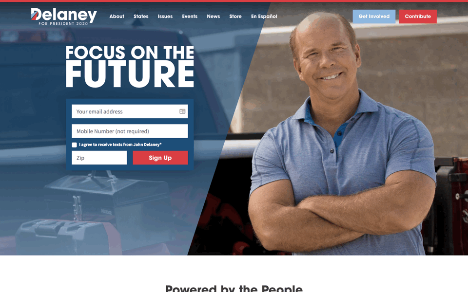
Looks like an early draft of the Julián Castro website. Another geometric sans serif for display (Avant Garde) though the sizing, spacing, and alignment is wrong at every turn. For someone with a relatively low profile, Delaney is missing an opportunity to distinguish himself with typography. Confidential to muscular bald dudes: posing with crossed arms may remind some of Mr. Clean.
(Dropped out in January 2020.)

18 April 2019
(last updated 31 January 2020)
One font I’m very surprised has never shown up in a presidential campaign: Interstate, which is modeled on the U.S. highway font, the one typeface that every American voter is already familiar with. (Update: Joe Sestak took my hint.)
The big problem with red & blue as colors is that they look great with white, but terrible with each other, because they have weak contrast, creating a vibrating op-art effect. The photo at left shows how the red tends to disappear into the blue, making the logo look like BID N. The designers of the flags for America, Great Britain, France, Norway, Costa Rica, Dominican Republic, and North Korea figured this out a long time ago.
After I published this piece, I learned about Andrew Papenheim’s even deeper dive into campaign design from February 2019. If this piece wasn’t nerdy and detailed enough for you, enjoy.