Professional typographers, like copy editors and grammarians, sometimes have a reputation for being humorless nitpickers. Certainly, the nature of the job requires some nits to be picked.
But humorless? On the contrary—the more you’ve trained your eye for typography, the more acutely you detect the continual butchery of our written language. For typographers, to look away would amount to dereliction of duty. But to constantly take umbrage would put us into a state of moral paralysis. Therefore, humor is necessary for survival.
The LTypI photo collection
LTypI stands for“Lack of Typographic Imagination”. This site collects instances where designers have chosen fonts that match the text in a perhaps too obvious way. I’m a contributor, of course.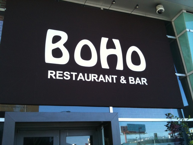
2,002 Honest Fonts
I return to this site every year or so. Without fail, I literally cry from laughing so hard. How is this possible? I can only conclude that, like“Flash Gordon” by Queen, this is a perfect work of art.Fuck Yeah Typeface Design
I honestly have no idea who runs this. But it punctures typographic pretentions with glee—and, as the name signals, some vulgarity. My favorite, however, is suitable for all ages. Beware: some very inside-baseball humor here. Further beware: if you get all these jokes, you have reached peak typography nerd.Typography 2020: a special listicle for America and Typography 2024: for America! for America’s best
My own contributions to this burgeoning genre.
Not funny: font puns (
“I shot the serif”, etc.), font-humor listicles (with images that were circulating on AOL in 1994), and Comic Sans (in particular, any McSweeney’s piece about Comic Sans). If you’re tempted to send these to me—please don’t.