What if I said I had a simple tip that could improve almost any digital slide presentation? Would that surprise you?
And rather than launch into a screed about the dismal legacy of PowerPoint and Keynote—which is sort of what you were expecting from a typographer, I’ll bet—what if I just told you the tip?
Because complaining about digital slide presentations—it’s been done, right? Like jokes about airline food. Like
But a simple and effective typography tip for presentations? That might.
So here goes.
As I said in Who is typography for, you should
Why? Because your readers—i.e., the people in the audience—will be viewing your slides under completely different lighting conditions than you, while you’re writing them. You’re probably sitting in a well-lit room, looking at the slides on a relatively small laptop or desktop screen. To you, the white background you chose for your presentation looks pleasant and elegant.
But if your audience is in a dimmed room, their pupils will be dilated, and their eyes more sensitive to bright light. So when those white slides are projected at epic scale, they’ll just become a series of GIANT WHITE RECTANGLES floating in the air for forty minutes. Staring at GIANT WHITE RECTANGLES for that long is painful. It will cost you reader attention. Under those circumstances, why should anyone be surprised that audiences hate digital slide presentations? And, ultimately, the speakers who use them?
To be fair, it’s not entirely your fault. The default themes packaged with presentation programs encourage you to pick something bright and kicky. This may help improve your productivity and job satisfaction. But it will not help your audience read.
So if your presentation will be given in a darkened room—here comes the simple tip I promised—optimize your slides for reading in the dark.
Before you start adjusting the typography, put yourself in the reading environment of your audience. Turn off the lights and darken your workspace so that the only light is coming from your computer screen.
“Whoa! That’s bright!” Now you’re getting it.Then, in your presentation program, start with a black background. Not dark gray, nor a dark gradient—just black.
You want to get the words on screen using the fewest photons possible. So try a thin sans serif font. (Nothing wrong with a serif font, but they don’t typically come in lighter weights.)
As for font color, pure white type on a black background can have an uncomfortable degree of contrast. So start your font at 50% gray and brighten it from there. When it’s legible, stop. The thinner the font is, the brighter it will need to be.
Pick a base point size that lets you fit 12–15 lines of text on screen. Not that you’ll ever be putting that much on a slide. (I hope.) But that’s a comfortable reading size. As much as possible, use this same point size for every slide—even if there’s only one line of text on screen. Constantly changing the point size between slides is annoying.
Beyond that, the other typographic guidelines apply. In particular, use color with restraint—prefer pale shades over bright ones. And avoid centered text.
Let’s see how this works in practice. (Click on the image to appreciate it at full size / full horror.)
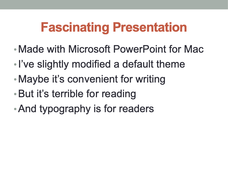
Giant white rectangle.
Boring system font.
Point size too large.
Line spacing too tight.
Huge centered headline.
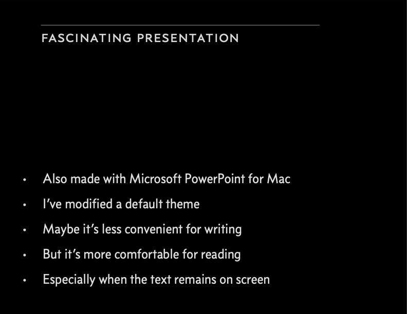
Calm black rectangle.
Concourse font in pale gray.
Point size reduced; line spacing increased.
Headline neither huge nor centered.
More
“white space” (which in this case is actually black space).
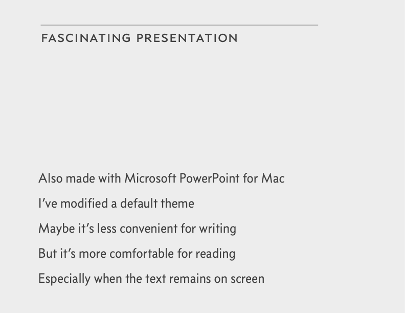
If your presentation won’t be given in a darkened room, the text-color problem is less urgent. Still, you should avoid putting pure black type on a pure white background. Making the background light gray, or the type dark gray, will reduce contrast and improve reading comfort.
You notice the pale gray background of the above slide mostly because here on the web page, it’s surrounded with pure white. But when projected under ordinary lighting, that pale gray will read as white.
This is an optical phenomenon known as
simultaneous contrast , which you might remember from middle-school science class. For instance, in the diagram at left, the center boxes don’t appear to be the same shade of gray, but they are.Do you really need list bullets? Maybe not. In body text, bullets make the start of each list item visually distinct from the start of a new line or paragraph. But in a presentation, if all your powerful points are less than one line, you can omit the bullets (as in the example above).
Recall from maxims of page layout that it’s wise to design outward from the text, not inward from the page edges. This is relevant to presentations, as the wide aspect ratios of computer screens are inconvenient for typography (and especially those of HD-style displays). Feel free to confine your presentation layout to less than the full width of the screen. No one will be bothered that you didn’t fill the whole space. But be consistent across all your slides.


