With grids of numbers, the typographic logic must follow the numerical logic. If it doesn’t, your typography is likely to confuse or mislead your readers about the meaning of the numbers.
If you remember everything from sixth-grade math class, you can skip this section. If not, then don’t.
Numbers work differently from words. A word is a sequence of characters. The whole sequence has meaning, but the individual characters do not. This isn’t so with numbers. A digit in a number has independent meaning based on its position relative to the decimal point (which may be implied). That’s how we can tell that the digits in
Numbers that are associated with a unit are called
Not all numbers are quantities, of course.
Your goal when typesetting grids of numbers is to make sure the typography reflects the underlying meaning of the number. To do this, there is one golden rule: in any column, digits with the same meaning must be vertically aligned with each other. This means that you shouldn’t merely select everything and apply the same formatting to everything. Different kinds of numbers need different typography.
Important caveat: the figures in your font will only line up with each other if they’re
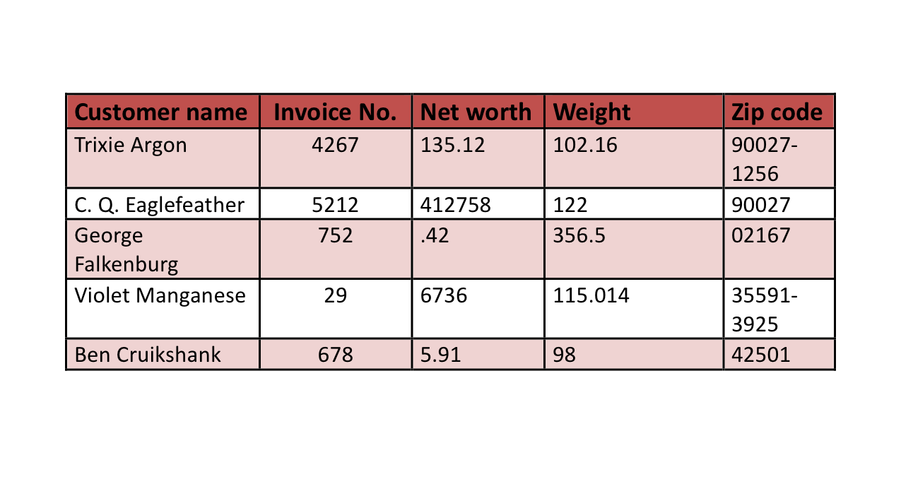
Numbers improperly aligned.
Garish color scheme.
Table cell margins too small.
Needlessly thick rules and borders.
Line spacing uneven.
Inapt system font (Calibri).
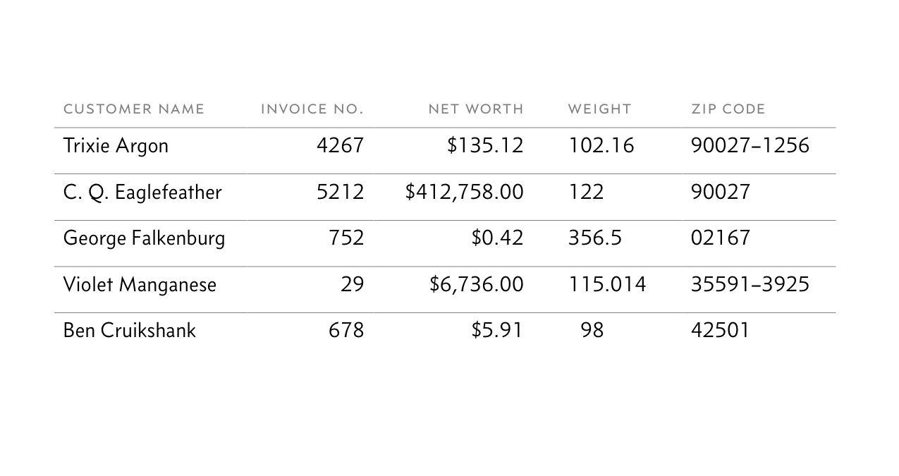
Invoice numbers (nominal numbers) aligned right.
Net-worth values (quantities) have currency symbols, commas, and cents. Then they are aligned right, so cents and dollars line up. If a quantity is between 0 and 1, add a leading zero for clarity.
Weights aligned with decimal tabs (see tabs and tab stops) so full pounds and fractional pounds line up.
Zip codes are aligned left, so five- and nine-digit zip codes line up properly. (Phone numbers would need to be aligned right.)
Unnecessary colors and borders removed.
Line spacing even.
Better font (Concourse).
As for the column labels, format those after you take care of the numbers. Sometimes you might need to make an inconsistent formatting choice to make them look right. For instance, in the revised example, the label
“If you padded out the dollar quantities to make them line up, why not do the same to the weights?” Tempting, but don’t. Unlike amounts of money, physical quantities communicate not only magnitude but alsoprecision . Therefore, the measurement98.000 pounds is not the same as98 pounds . The extra zeroes denote precision to a thousandth of a pound, which the second measurement does not claim (e.g., it might actually be 98.27 pounds).In a number less than 10,000, putting a comma after the thousands digit is generally a matter of style. For instance, both
$6736 and$6,736 are fine. But if those numbers are in a column (as in the example above ), the comma becomes mandatory. Without it,$6736 won’t quite line up with$16,736 .I’ll leave the choice of lining vs. oldstyle figures to you (see alternate figures). In a grid, however, I prefer the look of lining figures, because of their vertical consistency.