Typography matters because it helps conserve the most valuable resource you have as a writer—reader attention.
Attention is the reader’s gift to you. That gift is precious. And finite. And should you fail to be a respectful steward of that gift—most commonly, by boring or exasperating your reader—it will be promptly revoked.
Once a reader revokes the gift of attention, you don’t have a reader anymore. Then you become a writer only in the narrowest sense of the word. Yes, you put words on some pages. But if your reader has disappeared, what was the point? How is your writing more valuable than a random string of characters? Like the proverbial tree falling in the woods, no one’s there to notice the difference.
Unfortunately, many professional writers adopt a high-risk model of reader attention. Instead of treating reader attention as a precious commodity, they treat it as an unlimited resource.
What could be more presumptuous? Or dangerous?
Writing as if you have unlimited reader attention is presumptuous, because readers are not doing you a personal favor. In most cases, reading your writing is not their hobby. It’s their job. Which likely involves paying attention to lots of other writing too.
I’ll even go one better: I believe that most readers are looking for reasons to stop reading. Not because they’re malicious or aloof. They’re just being rational. Readers have other demands on their time. Why would they pay more attention than they must? Readers are always looking for the exit.
Writing as if you have unlimited reader attention is also dangerous, because running out of reader attention is fatal to your writing. The goal of most professional writing is persuasion, and attention is a prerequisite for persuasion. Once the reader’s attention expires, you have no chance to persuade. You’re just giving a monologue in an empty theater.
If you believe reader attention is a valuable resource, then tools that help you conserve that resource are likewise valuable. Typography is one of those tools.
Good typography can help your reader devote less attention to the mechanics of reading and more attention to your message. Conversely, bad typography can distract your reader and undermine your message.
I’m not suggesting that the quality of your typography is more important than the quality of your writing. It’s not. But typography can make good writing even better.
Consider a job interview. (Or, if you prefer, its social equivalent—a first date.) By the day of the interview, you’ll have spent a lot of time practicing answers to likely questions. But do you show up to the interview in a swimsuit and flip-flops? No, of course not. You wear clothing appropriate for the workplace. And when you talk to the interviewer, do you slouch in your chair and mumble toward your shoes? No, of course not. You speak clearly and confidently.
You do these things because you appreciate, as we all do, that nonverbal communication counts. Others draw inferences about us not just based on what we say, but how we say it.
It’s the same on the printed page. The substance matters, but if that’s all that mattered, then everything could be set in 12-point Times New Roman. And that would be the equivalent of mumbling toward your shoes. Just as good speaking skills matter during a job interview, good typography matters in a written document.
It’s easy to learn the skills to produce good typography. Beyond that, you need only the ability to form opinions about typography. And everyone who reads—even kids—can do this.
Unconvinced? Try this. Imagine you’re a director of human resources. Below are two résumés that you’ve received for a job opening at your company. Being a busy person, you only have two seconds to decide who gets the last interview slot. Who do you pick?
Don’t read the résumés—you don’t have time.
Just make a two-second decision.
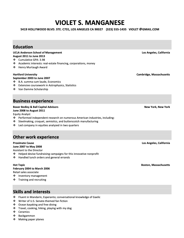

Whose résumé got your attention—Violet’s (the first one) or Trixie’s (the second)? Whose résumé better persuaded you, in two seconds, that the candidate was worth interviewing?
I’m guessing you picked Trixie’s. But why? Maybe you’d say Trixie’s résumé looked more professional, neater, or better organized. All true, but those qualities don’t appear out of thin air. And if you look again, you’ll see that the credentials on the résumés are identical. The only difference is the typography.
So what happened? The résumé with the better typography attracted the better quality of attention. Trixie will be getting that interview; Violet will not. Not only did you just prove that typography matters, you proved that it matters to you.
And if typography matters to you as a reader—a literate adult with no special visual skills or training—it matters to other similarly situated readers. Including everyone who reads your work.
Writers skeptical of typography often say,
Typography matters. The only question is whether you, as a writer, are going to neglect it.
If you truly preferred Violet’s résumé to Trixie’s, you didn’t fail some typographic litmus test. The point is the same—whatever preference you had, it was based on typography, not substance. (Though after you read more of this book, come back and see if you still prefer Violet’s résumé.)
The old adage that
“you can’t judge a book by its cover” may have been accurate a hundred years ago, before books had dust jackets. But it’s not accurate today. As the Second Law of Typography predicts, book shoppers have always been inclined to make judgments based on covers. So book publishers have learned to spend time & money creating covers that communicate something meaningful about the book. Therefore, judge all you want.