Talk given by Matthew Butterick at TYPO San Francisco, 11 April 2013 mb@mbtype.com
The Bomb in the Garden
 Photo © 2013 Amber Gregory
Thank you to the TYPO conference for having me. It feels like I’ve sort of completed a circuit, because I spoke at the first TYPO conference, back in 1995, in Berlin.
At the time, I had just moved to San Francisco to be part of the first wave of web designers. If that sounds like an obvious thing to do, it wasn’t, because unlike today, there weren’t really jobs for web designers. The business plan was sort of let’s show up and see what happens. And really, to most of my friends and family, the web was kind of weird and mysterious. They said to me, in the nicest possible way, “Butterick, you’re an idiot. Why would you do this?”
I was a type designer at the time. But I felt strongly that I needed to go work on the web. For two reasons.
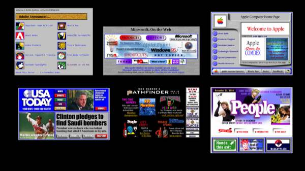
The first reason: because the web was primarily typography. It was ugly-as-fuck typography. But it was typography. These are actual slides from my 1995 presentation. (I held onto them because I knew I’d need them this year.) But I could see that the web was going to need typographers. Still does.
The other thing is that the web was really a blank slate. No one really knew what to do with it. We didn’t have trends then like mobile or social, these grooves for people to travel in. So the web was open to any creative people who could look at this thing that was void and without form and see the possibilities.
So now it’s 2013. Now the web is actually 20 years old. And obviously, in a lot of ways, the web has been successful.
But here’s what I’ve been thinking about recently. I’ve been thinking about how we’ve entered this phase where the creative spirit that’s always been essential to the core of the web is starting to get pushed out. And that’s what I’m going to talk about today.
And my main goal today is not to convince you of every point I’m going to make. Lord knows, you’re going to disagree with a few. Rather, my goal is to get you to take this problem seriously, as designers. Because as designers, this problem affects all of us. It affects the work that we’re allowed to do with the web. It affects our careers. And it’s not someone else’s problem to solve. It’s our problem. And it’s our problem now. So I feel like we should all be thinking about how we want to fix it. And it’s a hard problem. But designers, for the past 20 years, have always had an important role in both criticizing the web, and moving it forward. So we should feel like it’s something we can do.
So in fact, let’s start with that idea:
It’s strangely difficult, right? In this country, you can pick on the energy industry, you can pick on biotech, health care—god knows you can pick on lawyers. But when you start saying things about technology companies, it’s like you punched a baby in the face. People don’t like that. Why is that? Why does technology get more slack?
In one sense, I feel like maybe it’s because here in the US, we’ve always been much better at creating new things than preserving the old ones. So we have to tell ourselves this myth about the infallibility of technology and progress. Because it plays to our strengths. That’s what we’re good at.
But the technology industry in particular really spins this myth into this self-serving idea that consuming technology has no consequences. We don’t usually fall for that. When an American corporation tells you “hey, just have all you want of our product, please, go ahead”—do good things usually happen? No, never.
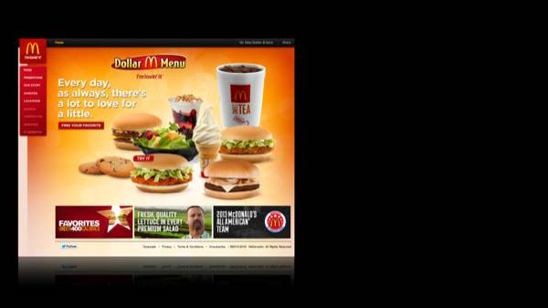
For instance, McDonald’s. Their food looks delicious. Their food is delicious. Their food is scientifically engineered to be delicious. But we know that if we eat all the McDonald’s food we want, we’re going to get a big fat ass. So we have a sense of the consequences.
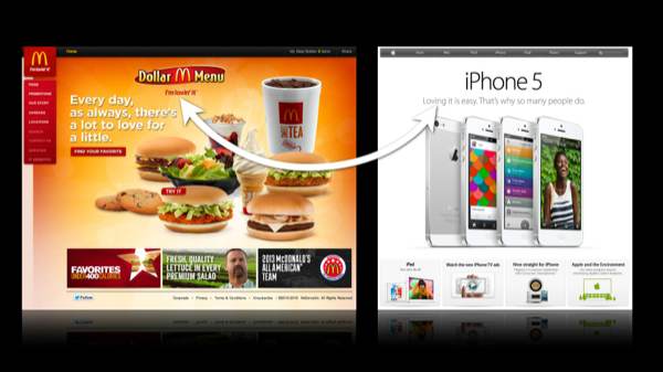
Whereas with technology, I don’t think we’re as skeptical. But we should be. Because technology companies sure love to hitch a ride on these human virtues. Look at what Apple’s done here. They’ve taken this McDonald’s slogan and they’ve made it even creepier. Instead of I’m lovin’ it, it’s iPhone 5. Loving it is easy. That’s why so many people do.
I’m thinking—[holding up iPhone]—I’m going to have to break up with this iPhone. Because it’s a little more emotionally needy than I was looking for. [Addressing iPhone:] And now I know about you and all the other people! Get out of here! [iPhone is thrown off stage.]
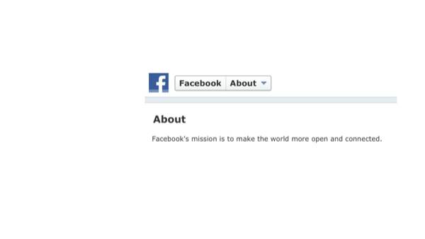
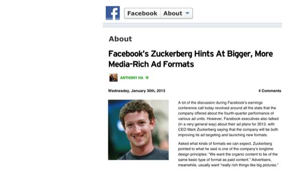
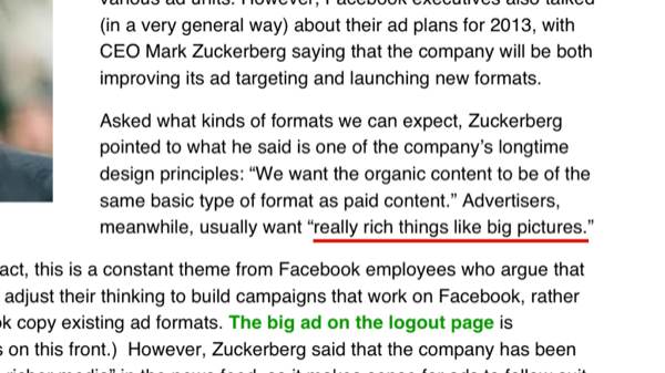
Or think about Facebook and its mission statement. Facebook’s mission—I hope you know—is “to make the world more open and connected.” Did you ever wonder what Facebook means by “open and connected”? Well, they’ve told us.
They mean “bigger, more media-rich ad formats.” They also mean “really rich things like big pictures.” I don’t know about you, but when I think about “open and connected,” I don’t think about really big ads. But that’s what they mean. So we should be critical about what these companies want from us, and what they’re offering in return.
Especially as designers. Because part of our job is to tell the truth. If you think that your job is to put blue rectangles together with Helvetica, that’s cool. But to me, that’s not enough. To me,
Because design wants more from us. It wants our humanity. It wants our optimism. It wants our honesty. It wants our ideas for what a better world looks like. Some days, those are small ideas. Some days, those are big ideas. And the web includes both kinds.
I’ve sometimes heard that it’s too soon to criticize the web. “We need patience. It’s getting better. These things take time.” Here’s the thing: I really do feel like—
And not only has the web gotten 20 years, it’s gotten billions and billions of dollars of investment capital and human time. If any technology product should be subject to high expectations, it’s the web.
And anyhow, what’s wrong with impatience? We’re impatient about all kinds of other technology. We’ve got to stand in line, outside the big cube, for the iPhone. So to me, I feel like, geez—the web is a more consequential technology than the iPhone. We should really be more impatient, not less.
Call me a romantic, but I take it as a given that—
That’s what originally drew me to the web. It’s what originally drew many others to the web.
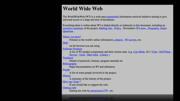
But it’s also part of the original mission of the web. Here’s the very first web page, which was posted by Mr. Tim Berners-Lee, who’s credited with being the inventor of the web, over at CERN in Switzerland. Look how he described the web: as an “information retrieval initiative aiming to give universal access to a large universe of documents.”
Obviously technologies go on to have different uses than their inventors expect. But I think that principle still has currency today. And maybe that’s just my bias. Because I think we should have “universal access to a large universe of documents.” I think we should lower the barriers to creating, lower the barriers to learning. Because every time we do, we win. Humanity gets smarter. Our lives get better. And that’s why the written word is by far the most consequential human invention. It’s been the key to all these other improvements in our culture. And the web is the next manifestation of the written word. But more than that, it really should be the best manifestation. It’s got so much going for it.
And that comes back to the other thing that I said drew me to the web: that it was a typographic medium. It was true then. It’s true now. Much of the web is made of typography and design. But despite this, the web isn’t the best manifestation of the written word. In fact, quite the opposite: the web really doesn’t have a culture of design excellence.
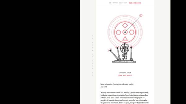
That’s not to say that design excellence doesn’t exist in places. It does. Here’s Frank Chimero’s online book, The Shape of Design. I think this is pretty much perfect, as a web-based book goes. But it’s an outlier. A design culture doesn’t mean outliers. A culture is a habit. A tradition. A standard of quality. There aren’t that many examples like this.
Now, you may say “hey, but the web has gotten so much better looking over 20 years.” And that’s true. But on the other hand, I don’t really feel like that’s the right benchmark, unless you think that the highest role of design is to make things pretty. I don’t.
I think of design excellence as a principle. A principle that asks this:
That’s what it should mean. Because otherwise it’s too easy to congratulate ourselves for doing nothing. Because tools & technologies are always getting better. They expand the possibilities for us. So we have to ask ourselves: are we keeping up?
You can decide for yourself. Let’s go to Butterick’s first annual quest for design excellence on the web.
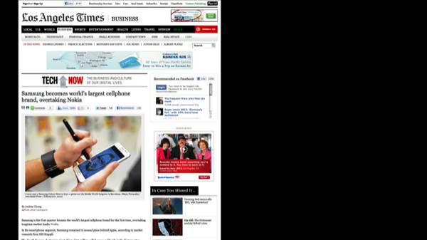
I’m going to show you a few websites. Because I was thinking to myself: if I wanted to find some design excellence on the web, where should I go? And I thought, what’s a type of organization that has a commitment to design, and designers? And I thought, well, newspapers do. A lot of the world’s newspapers are very well designed publications. We know they have designers on staff. We know they have budget for design. OK, so let’s go look at their websites.
That’s the Los Angeles Times. My local newspaper.
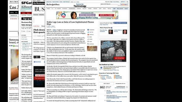
The San Francisco Chronicle. The SF Gate. That’s pretty bad.
The Washington Post. I want you to notice one big thing here. Not only are all these websites awful, they’re all awful in exactly the same way. We’ve just seen three sites that pretty much have the same pattern: a cluttered toolbar on the top, and then they’ve got the banner ad, they’ve got the article on the left side, and then they’ve got more ads and links and other junk in the right column.
Let’s keep going. The New York Times. Right? I think we’ve seen this.
The Guardian, in the UK. A little variation there, a few more links, but still basically the same.
Le Monde, from France.
And finally, Die Zeit.
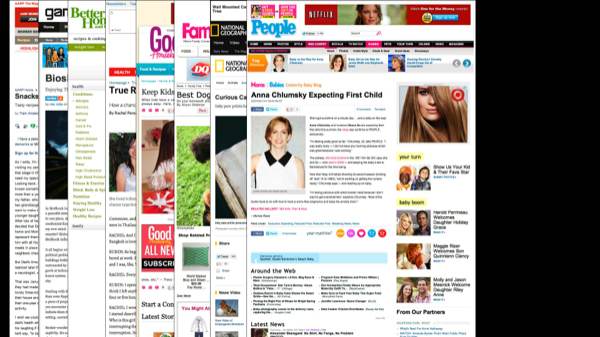
A friend of mine said “Butterick, you’re being silly. Because newspapers, they’re dinosaurs. They’re going out of business. Why would you look to them for design excellence?” And I said OK. So who would have money for design excellence? Because newspapers don’t. I thought, I’m going to look at the most popular magazines in America by circulation. Because I figure they must have the money to do something pretty good, right?
All right, so there’s the AARP Journal. Do you feel like this is familiar at all?
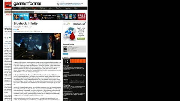
Game Informer. Did you know these were the most popular magazines in America? Game Informer, totally awful.
Better Homes & Gardens. I mean, this is—I don’t even know what that’s about.
Reader’s Digest. Look, they even use a couple webfonts. But basically the layout is the same.
Good Housekeeping. Oh my god.
Family Circle. You had no idea. I mean, this is just—look at all the ads on these pages, it’s astonishing.
National Geographic. This is amazing. They’ve actually tripled the number of toolbars they fit into the top. And they’ve got not just one logo in the corner—they’ve got two logos! That is so webtastic! You’ve got to have the logo in the upper left corner. I’d like to have my name dangling around the upper left of my head as I walk through life: Butterick.
People magazine. Awful. Though congratulations, Anna Chlumsky.
Woman’s Day.
Time. Even Time. Some nice people have worked on Time. The website is shit.
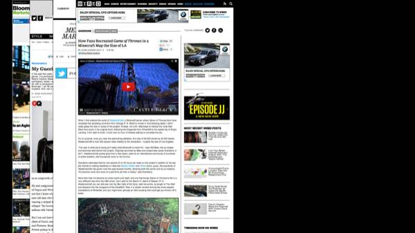
All right, so you might say I’m being foolish here. Those are just popular magazines. What do they know about design? And so I thought, how about this. I’ll look at the magazines that were nominated for National Magazine Awards in the design category in the last five years. What do you think we’ll find?
Hmm. Bloomberg Businessweek.
GQ. Oh my god.
Interview. OK, they’re shaking it up a little bit. Still pretty bad.
Wired. My god, Wired. It looks like Game Informer. I mean, what’s going on here?
New York magazine.
OH JESUS! That’s hideous! What is that? Esquire? These are actually good looking publications, a lot of them. You’ve seen them. But what the hell happens when they go on the web? They just lose their minds. They give up.
And Good magazine. Again, all these print publications were nominated for design awards. But they go on the web and they do this.
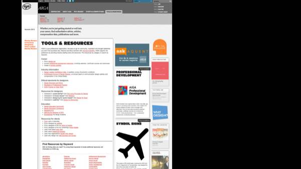
So I say to myself, you know what—I’m expecting too much. What if I looked at publications about design for designers? That must be a place where I could find some design excellence.
Whoa, OK. Nice Helvetica there. Thank you, Eye magazine.
And the AIGA. That’s again, pretty dull. These are going to go from best to worst. That was the high moment. Eye and AIGA. Now it’s just going to get more and more boring.
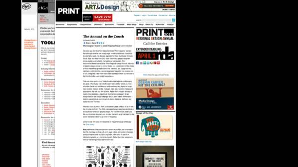
Ugh. It’s like looking at blogs.
I’m sorry, Design Observer. I like the content on your site. But this was the typography of 1998. You’re using 6 point Verdana?
Communication Arts. Sorry, conference sponsor, I don’t like your website. It’s no good.
Why is this so disappointing? It’s disappointing because we want to like these publications and these organizations. But they’re hurting design! They’re hurting design, because they’re setting a bad example. They’re just following what everyone else is doing.
And I even found outside, before this speech, this magazine. This is the Communication Arts typography annual. I’m not going to pick on them. I just want to note, though, in the pursuit of excellence—16 typefaces in here are singled out for recognition. And do you know how many websites are singled out for typographic recognition? One. One website. After 20 years, one website gets to be in the annual. Pretty sad.
That’s my evidence. I’d be happy to look at yours.
So, the culture of design excellence. Why don’t we have one? And here, I think, is where the plot thickens. Because I’m going to contend to you that there are two serious structural flaws in the web. And here’s the biggest one:
Someone’s already tweeting—“Butterick is an idiot. He doesn’t know that information wants to be free.” You know, I have heard that. But I also know that 99.99% of people who mention this line forget to talk about the first and last parts of it.
This was said by a guy named Stewart Brand, way back in 1984.
So what’s the message here? Information wants to be free? No, that’s not the message. The message is that there are two forces in tension. And the challenge is how to balance the forces.
The web, however, has never balanced these forces. The web has always been great for making information free, and terrible at charging for it. And that’s a technological flaw that’s existed since the beginning of the web. So from early on, folks took this lemon and tried to make web lemonade by latching onto the belief that exposure mattered more than money.
Does this sound familiar, designers? “This project’s going to be great exposure.” It’s never true. It’s never been true. It’s never been true on the web. But it became one of the web’s core religious beliefs.
The problem, of course, is that information wasn’t actually free. It’s just that no one wanted to pay for it. But somebody had to. So we’ve ended up with what?
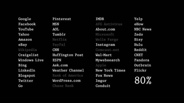
Again, I know that paywalls exist. There’s like three or four of them that actually work. Those are outliers. Here are the 53 top US sites, as ranked by Alexa. (I left off the porn.) How many of these sites do you think rely on advertising revenue?
The answer: 80% of them.
And it’s not that all advertising is bad. As with that quotation we saw before—it’s a question of balance. Because advertising isn’t creation. It’s marketing. It’s selling. And it’s not incompatible with the web. I can believe that advertising has a role to play in subsidizing certain kinds of web content.
But advertising depends on a healthy creator habitat. Creators have to be making stuff that people want to pay attention to. And if you destroy the creator habitat, what happens to advertising? You destroy that too. Then there’s nothing. So even if you like advertising, it’s still really important for the web to take care of the creators.
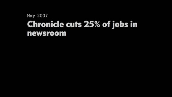
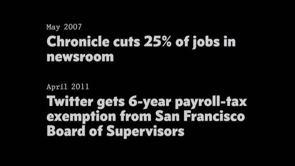
Moreover, when so much of the web depends on ads, you also start to get unintended consequences. Like city newspapers—your dear old San Francisco Chronicle. Call them dinosaurs. They are. Say that they deserve to go out of business. Maybe they do. But newspapers like this have traditionally performed an important watchdog function, keeping local businesses and politicians honest. Because that’s part of the culture of news journalism. It’s not part of the culture of the Huffington Freaking Post. And as these newsrooms die, we’ll inevitably—it’s like a law-of-gravity guarantee—we’ll inevitably see a rise in private & public corruption. And when that happens, in a very real way, we’ll have traded good government for banner ads.
And it’s happening here. Look at this.
The Chronicle’s circulation is also off about half in recent history. I mean, that paper is going down the drain. And then, you start to see things like this—
Isn’t that crazy? A technology company’s being paid with tax dollars to stay in San Francisco? That just boggles my mind. That’s a tens-of-millions of dollars benefit to them. So we’re just going to see more of this.
We might find a tiny silver lining in all this if the web’s advertising economy were actually healthy. But it’s not. In fact,
The problem is that as everyone has bet on ads—80% of these sites, right?—ads have gotten less valuable. As ads have gotten less valuable, you have to generate more clicking and more ads.
That’s why everything is a slideshow now! You know how it works: You’re doing your job, and you come across a link like this:
It’s like, oh shit—I have to click on it. I like how the link “goes viral”—don’t be the last person to not make it go viral! You’ve got to click on it. And it comes out of some kind of crazy link generator that knows what people will click on. This one doesn’t even have bikinis in it.
But of course you click on it.
And oh god, there’s the cute dog. I mean, they’re giving you what you wanted: the dog, and the bird, and the bunnies.
But then you scroll down, and it’s like oh no, there’s a 73-picture slideshow. There’s videos of dancing dogs. How can you say no? You’re there.
And this, my friends—this is the the death spiral. It’s an adorably cute death spiral. But a death spiral nevertheless. Because the value of this web page is not determined by what’s on it, but rather its ability to attract clicks from across the web, and then generate some more clicks. And that’s true of the next page in line. And the next one. And the next one. So the incentive is not really to hold reader attention, but to manufacture distraction.
And this does create a real problem for designers. Because—
Because a web page view is like any other product. You have to spend money to manufacture it—you have to build the site, maintain the servers, and so on. And then you can make money from it—for instance, by putting ads on it. But you have to make more money than you spend, otherwise you’ll go broke.
So one of the biggest costs of a web page is the cost of what? Creating & implementing the design. So as ad revenue goes down on the web, all the costs have to come down. And that includes the cost of design.
Go back to the dogs. The only real design consideration on this page is how you get the reader to click again. If you’re the Huffington Post, how much will you spend on design that makes the content readable and appealing? You’re going to spend as little as possible. Because it’s irrelevant. This page, and so many others like it, are just ad-delivery vehicles.
So, designers—I know, your head’s spinning—we still might be able to manage design excellence, if it were possible to create excellent web design cheaply. Because we’re going to have to do it cheaply, with the advertising pushing costs down. This was supposed to be one of the virtues, I think, of web standards. Right? But as anyone who has developed big websites with web standards finds out, you discover a terrible truth—
I was saying before that the web has these two big structural flaws. The first, that it’s bad at making information expensive. But this is the second.
And I know—somebody’s already tweeting: “Butterick’s an idiot. He doesn’t like web standards.” No. I like standards. I think the web should have standards. I even think the web standards that we have are better than none at all. Because they do make easy things easy.
But as a designer, my job is not to do easy things. My job is to do hard things. And that’s where web standards create misery.
And the misery exists because of the W3C—the World Wide Web Consortium. That’s the organization that supervises web standards. They’ve been so slow over the last 20 years at adopting standards. And way too lenient in enforcing them. And so we have these problems getting created at the standards layer, and they just kind of flow downstream, like toxic waste, down to the HTML and CSS layer. Where designers work. And then it becomes our problem.
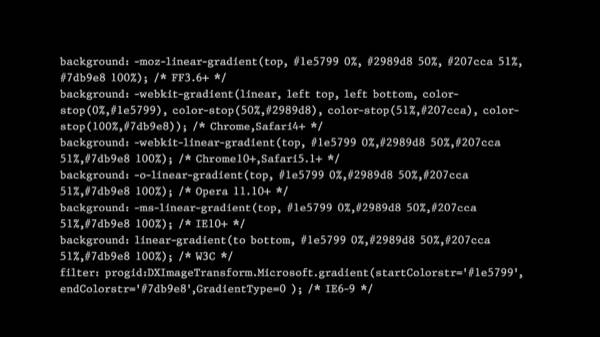
For instance, what you’re looking at here. I recently learned on a project that this is the current preferred way of creating color gradients in CSS. Web standards were supposed to eliminate the complexity of browser-specific markup. But in practice, you still need to use all these crazy hacks and workarounds and overtagging to get results that are actually standard. Here, you’ve got to write a line for seven different browsers.
Standards were also supposed to reduce testing complexity. For instance, when you make a PDF, does it even occur to you that you should test it on five different platforms and 10 different PDF readers? No. Because PDF is an ISO standard. It just works. Whereas for websites, you never really finish testing. You just give up.
So this brings us to the big consequence, which is that—
Because for us, as designers, these nonstandard standards—they limit the things we can accomplish. And they also waste our time, by making us fix all this stuff that was never supposed to be our problem in the first place.
Now, I can get angry about this, and someone’s always like “yeah, but Butterick, that’s just the web, man. That’s just the way things are.” And I say, you know what? I think it’s time to lose that attitude. For one big reason:
Because over the last few years, it’s been rapidly losing ground to app platforms like iOS and Android. Losing ground to media platforms, like the Kindle.
For instance, if you ever use your iPad to browse the web, you’re seeing more of this. Are you seeing these? It’s like “you can’t use our website, but you can see our ad for the app.” And I like how all these ads are showing you an iPad that’s having a much better time than your iPad. This person has nicer fingernails. They’ve got a cooler cup of coffee. Oh, I need to get that freaking app! I need to stop using the web!
Why are publishers gravitating toward apps? For two reasons. Go back to those two flaws.
For one thing, apps make it really easy for information to be expensive. They make it easy to collect money.
The other thing is that the technical standards are totally standard. That’s especially true with Apple and iOS. It’s a very smooth developer kit. And as for testing—the benefit of developing for iOS is that there’s a huge number of devices in circulation, but there aren’t that many types. So the testing burden is relatively manageable. It’s easy to see now why apps—if you wanted to make money—why apps would be a more appealing development platform.
The web didn’t have to compete with this in the past. Right? But it does now. So the question emerges: are the habits of the last 20 years the right ones for the next 20 years?
To me, the answer is clearly no. Either the web is going to have to adapt to today’s marketplace, or it’s just going to get restricted to this smaller and smaller box. And like I said at the beginning, you as designers, you may think “well, advertising, technology, whatever.” But it is your problem. Because you’re in that box. As the possibilities of the web shrink, so does web design, and so do all the things that you can do in your career.
So what are we going to do about this?
Well, I told you before what I think the biggest flaw of the web is: that it can’t make information expensive. So I think we need to start there.
There are different ways to do it. But this function needs to integrated with the web at a low level. And I know as designers, we don’t really control this. But we can advocate for it.
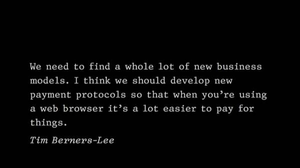
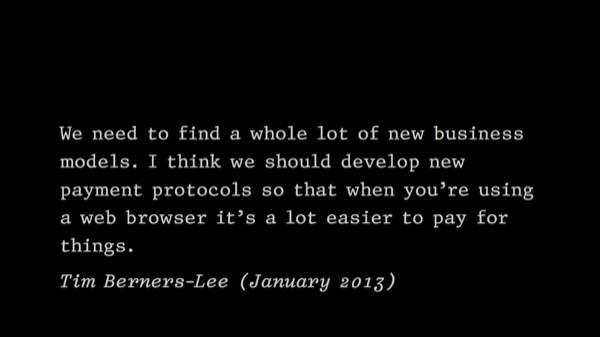
Even the inventor of the web and the current director of the W3C, Tim Berners-Lee, agrees with this: he said—I love this—
I love that, Tim. Did you say that 15 years ago? No. Well, did you say it five years ago? No. When did you say it?
You said it three months ago?

Oh man. I mean, has he just been holding out on us? This is the guy—he’s not the boss of the web, but he’s an influential voice in setting the agenda for what the web standards are.
So, I wouldn’t be the first person, by far, to criticize the W3C for being slow and out of touch. But we’ve entered this phase where the web really does need to move faster. And the W3C doesn’t do fast. So respectfully, but quite seriously, I suggest: let’s—
I mean, why not? And not in anger. Let’s thank them for all that they’ve done to get the web to this point. But we’re ready to take off the training wheels. And now that the web has competition, we really have no choice. The costs of delay are getting more severe. Think about those ads popping up for apps—“use this, instead of using the web.”
And if you worry, as some do, that the alternative to no W3C is chaos, or if you worry that the alternative is a web ruled by Google and Microsoft and Apple—I don’t think so.
I think the alternative is a web that’s organized entirely as a set of open-source software projects. And we didn’t have that choice 15–20 years ago, at the beginning of the web. Because open source hadn’t quite arrived as a way of doing things. But it has now. In fact, it needed the web to get it going. But we’ve seen plenty of technologies that are integral to the web—Linux, Apache, Perl, Python, WordPress—all of these technologies have succeeded without a W3C-style supervising authority. In fact, they’ve all evolved a lot faster than the web has. So the web needs to catch up now. It can do that by learning something from these projects. The W3C was a great model at one time. But it’s not anymore.
While we’re getting that web revolution planned out, I think we should also, as designers—
Because standards-based design has often seemed to mean: let’s start with standards, but then, when it’s time to make it work in all those browsers that don’t support standards correctly, we’re just going to put in all the patches and hacks and everything.
This is what economists would call moral hazard. Moral hazard means that rather than punishing the bad browsers for their bad behavior, you’re indulging them. You’re accommodating them. So what do they do? Do they stop? No, they keep doing it. And you get the opposite of what you want. Instead of the bad browsers coming into compliance, you get 10 years of your career spent figuring out what Internet Explorer 6 can do. That’s a terrible use of a designer’s career, in my opinion.
I think we also have this question of whether the traditional web-standards view of the world is somewhat obsolete. Because it emerged about 15 years ago, an era where we mostly used the web on desktop computers. There were only three or so browsers that anyone cared about. And now we have all these other web-enabled devices and so on.
I don’t think it’s practical to tell designers & developers that they should only stick to web standards, and ignore the other innovations of these devices. But on the other hand, it’s not practical to think that any standards-making process is going to move fast enough to cover them. And that’s really why apps have been drinking the web’s milkshake recently.
So having web standards that are truly standard would be a good start.
But beyond that, I think that standards-based design should denote a smaller idea. It should focus on a smaller territory where it can work well, and work consistently, rather than trying to offer itself as this holistic approach to web development. Because historically, it just keeps coming up short.
Though sometimes I wonder whether designers have been overly patient with web standards because they don’t totally appreciate how programming standards usually work. So designers’ expectations are lower than they ought to be.
Which brings me to my next topic—what should designers know about programming?
And I know that some of you will think this is beating a dead horse. But when we talk about restoring creativity to the web, and expanding possibilities, we can’t avoid the fact that just like the web is a typographic medium, it’s also a programmable medium.
And I’m a designer who actually does a lot of programming in my work. So I did read the other 322,000 comments about this on the web. I still think there’s a simple and non-dogmatic answer, which is this:
Because there are good things about it. I’ll tell you what I like about programming. First, though, I want to clear up a misconception, that I gathered as I read the 322,000 comments.
HTML and CSS—those are not programming languages. Those are data-entry formats. So if you as a designer have ever looked at HTML and CSS and said, “you know what, I would rather drink bleach than learn how to do that,” then I think you’ve got the makings of a great programmer. Because nobody wants to work with that stuff. Programmers hate tedious work of any kind. I hate HTML and CSS. That’s why I like programming. Because the point of programming is to represent ideas at a higher level. Which I think is very much something that we like to do, as designers. Represent ideas. We can do that in the programming language. Then we can let the computer handle the boring nonsense.
All right, so why do I like programming? Here are three reasons.
One, like I said—it can eliminate a lot of boring work. That gives me more time for the fun parts of the project.
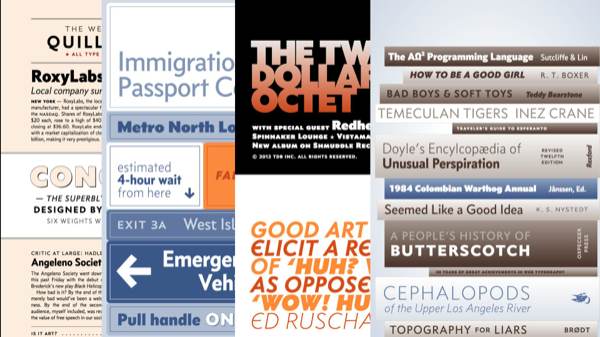
Two, programming actually expands the scope of what I’m capable of as a designer. For instance, here’s a website I did for my font Concourse. My goal with this—these are all web pages—I wanted to do something I hadn’t seen before, which was to do web typography, using webfonts, and make it as close as I could to a PDF, in the sense of being rich and detailed. I also made it editable. I also made it scalable.
But the idea of trying to do this by hand—I just would’ve quit in despair. I would’ve been in tears, scratching my eyes out. So rather than try to do it by hand, I wrote some Python code that generated all the HTML and CSS.
And the third reason I really like programming, it’s kind of an underrated thing. But once you know a little bit about what can be accomplished with programming and with code, you start to expect more from yourself, and from the people you work with, and from the medium you work with, the web. Even if you don’t know a whole lot about programming, you understand very quickly that there’s very little that’s truly impossible. So when you have conversations with other designers, and other programmers, you realize that when people say “that can’t be done” or “that’s impossible,” what they’re really saying is “I’m just too lazy and stupid to figure that out,” or “that’s not my job” or “I don’t want to.” Again, if you’re into that, fine. I like figuring out how to do things.
So that’s my pitch for programming. If it’s not for you, that’s fine. But don’t rule it out without trying it.
I also think that web designers would do well to—
Because on the web, authors have really endured a lot of the same slings & arrows as designers. Only worse.
And when I say book, I don’t mean the shitty thing that Amazon sells on your Kindle. I just mean this idea—this place in our culture where deep thinking can happen. Where a writer can do this thinking that you can’t do in 140 characters, or even 140 blog posts.
Going back to the original premise, I think that if the web is the best manifestation of the written word, then it should also be a great book-publishing tool. The web should really encourage authors to write books. But it doesn’t. It really doesn’t. The best you can do on the web is make an ugly book and give it away for free. That’s not good enough for most authors.
And it goes back to that problem with making information free. When you reduce the incentives to publish, you’re not just impoverishing authors. They’re just finding other things to do with their time. It’s like “why am I going to write, and go through the hassle? I’ll just play Xbox.” So what happens is the books disappear. They never come into being. They never get made. Authors find something else to do with their time. When smart people who could be sharing their ideas choose not to—that’s a real loss, to all of us. And then when it’s technology that’s deterring them—that’s kind of crazy. So I feel like we’ve got to do better.
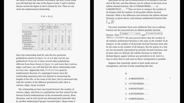
Think about iBooks, on the iPad. To be better than the web, it doesn’t have to do much. All iBooks has to do is solve these two problems I’ve been talking about—solve the economic problem, solve the technology problem. And it does. Here are a couple pages from George Gamow’s wonderful book One Two Three … Infinity from 1961.
Notice the parts that are pasted in. These are actually scans from the 1961 printing. Some of you probably recognize—that’s letterpress printing. So what are we finding out here? What we’re finding out is that in book typography, the iPad is not keeping up with the printing technology of the ’60s. Pretty sad, right.
I like the “V+F” in the diagram—it’s as if the person who was doing this was like “I can handle V+F = E+2.” Then they get down to the table and they’re like “ah, fuck it. I want to hire that print shop from 1961. They did a good job with that. Yeah, that’s nice.” So we’re not doing so well with the printing techology of the ’60s.
But how are we doing with the pinball technology of the ’60s? Here you go. This is also on my iPad. A pinball simulator. This is amazing. This is a 1966 pinball table. Fully playable. It’s got sound, colors, physics. Look at the upper right hand corner. They’ve even simulated this toy monkey that rings a bell every time you get 100 points. I mean—is this what we want? Pinball is winning, and books are losing? It’s not what I want.
I really think that reinventing the book is a hugely important project. And we’re nowhere with it. Books on the web should be the best books we’ve ever had. And it’s not like we don’t have role models. Look at Frank Chimero’s book from before. I think if every author could make a book like this, and make money from it, then every author would be publishing on the web. But they can’t. So they don’t. We’re not there yet.
But I don’t say that pessimistically. I think we can get there. And I’m optimistic, always—even though I’m pessimistic about certain technology organizations—I’m optimistic about people and designers changing things for the better. Because that’s how we got to where we are today.
But today, the web wants more from us. Web design wants more from us.
Because a lot of you, maybe most of you, are going to spend most of your design career putting things on screen, and on the web. Not on paper. So again, going back to my first point—my major point today is that I hope you feel invested in this struggle, because whatever happens, it’s going to affect you for a long time.
As I said at the beginning—designers have always been vital to the web, in terms of exploring its capabilities and sharing those possibilities. So as we stand here at the 20-year birthday, let’s not forget that. We’re not mules. We’re not sheep. We’re not data-entry drones. We shouldn’t tolerate a web that relegates us to those roles.
We need to work for the web that we want. To reinvent. To demand better. It’s not that we’re going to get everything. But if we work at it, we’ll get something. And if we don’t work at it, we’ll definitely get nothing.
But either way, we’ll be getting the web that we deserve.
Thank you.
⁂
Related
Butterick’s Practical Typography
My new web-based book. It includes a few more thoughts about what design excellence on the web should mean.
Reversing the Tide of Declining Expectations
Technology invites designers to take shortcuts, but we have to ask more of ourselves.
Rebuilding the Typographic Society
In its purpose and method, typography is inseparable from humanity’s most consequential invention: the written word.
Comments
I work in book publishing and am seeing the gradual degradation of quality design on the web mirrored in the quality of e-books, which is hardly surprising considering their shared structure and the way browsers and reading environments similarly disregard “standards”. E-ink Kindles are our IE6, iBooks our Chrome.
Arguably publishers are partly to blame for this; for years we put out poorly proofed and poorly formatted texts into a nascent marketplace. It’s partly our fault that readers have come to expect less from e-books than they do from printed books.
Of course the difference between e-books and the web is that the former is much easier to charge for, which is both good and bad; we’re in a situation where the vast majority of our books are sold into a reading environment that has the least support for prevailing standards. It’s akin to IE6 being the only place you could sell web content.
I guess what I’m really concerned about is that people like you and me are in this space where these things really matter to us, but the average website user or e-book reader is now accustomed to these really low standards of quality, and that some people will never want to pay more/anything for something that looks or behaves better.
—Eoin Noble
I also originally came from a art background, followed Comm Arts and all of the industry stuff and there is idealism and there is reality. The day to day business of artists and designers does not generally involve a blank slate and a blank check—it is difficult to see how many of the problems you showed have much to do with the Web or standards related to as much as they do that businesses are interested in making money … I think the Web as we know it will evolve significantly and I have high hopes that given events in the last year or two we are on the verge of a shift where we’re figuring that out.
—Brian Kardell
I agree with you in a lot of ways. I do not like what has happened to the internet. The goal of making rich and interesting designs has been replaced by a vast wasteland of corporate advertising garbage.
—Dennis Saeva
The problem with the web and payments is (in my mind) the ghastly state online payment is in. … Although it is designers and programmers who have to actually solve the problem, it is ultimately a banking problem. And sadly banking haven’t established a reputation of being very progressive in regards to technology lately. I strongly believe that we’re going to be stuck with broken ad-based revenue models until the payment problem has been solved.
Regarding your other proposal … [m]aybe the solution is rapid development through a open source model, with a standardizing organ, such as the W3C, creating a certain baseline standard/recommendation. What they do well is provide one centralized reference.
—Kristian Kalvå
[T]he main problem is that designers are taught that they need to match each other’s designs–especially on the web … [t]his was the case with me at university. The irony is that I see the most enjoyable designs coming from people who have no formal education in design (mostly developer blogs). It seems as though the underlying problem here is the electronic design industry as a whole: not necessarily the W3C. However, I agree that the W3C should be disbanded; the web does need to take a more organic evolutionary path. Don’t be fooled into thinking that disbanding the W3C will do anything about bad design on the web, on the contrary, it will likely give the bad designers more tools with which to shoot themselves in the foot.
—Jonathan Dickinson
Designers are always put into a situation where the design is judged by people that are not qualified to do so. … [t]he market will either prove that good design begets better profits, or more design-appreciating managers will succeed and natural selection will sort out the rest. … I gave up trying to make the world pretty because everyone that was willing to pay me wanted to make it ugly. After a life of design, I am changing careers altogether.
—John Carvalho
The W3C doesn’t “adopt” standards; the market does. The W3C doesn’t really even create standards for Web browsers; browser vendors do. The W3C brokers the creation of standards by providing a place for browser vendors and others to get together to reach agreement on details of new browsers technologies in such a way as they’re willing to actually implement them. The W3C has zero means for “enforcing” standards for browser technologies.
Getting agreements among implementors is the really hard part, and there’s no magic to make the process of reaching agreements quick, easy, and painless. ... Nowhere in Matthew Butterick’s talk is there a real proposal for how we could get agreements any quicker or easier or less painfully than we do now by following the current standards-development process.
—Michael Smith (on the W3C blog)
Postscript: about the W3C.
Since I gave this talk I’ve heard from numerous defenders of the W3C, including Michael Smith. The two major threads: a) the W3C’s job is inherently hard, so we should excuse its mediocre performance, and b) there are no alternative methods of developing web standards. Therefore, apparently, we have no choice but to accept the W3C and its methods.
Are you persuaded? I’m not.
Not true. The W3C could refuse to renew the membership of organizations that took actions contrary to the spirit of web standards, including repeatedly failing to implement them. If the W3C made participation in the consortium contingent on timely implementation, members would either comply or quit.
But it doesn’t. So the W3C essentially rewards its members for undermining web standards—another version of the moral hazard I mentioned earlier. For instance, it’s crazy that a company like Microsoft can put six employees on the CSS working group to help make standards, and then have hundreds of engineers back at headquarters destroying them—year after year after year. And for once, let’s not blame Microsoft. It’s simply behaving consistently with its principles. The W3C, however, is not.
If you know a W3C staffer, ask them: what benefit does the W3C get from maintaining the membership of corporations that have repeatedly failed to implement standards? I mean, aside from annual membership fees of about $70,000. (More on that below.)
The web doesn’t need a standards process that’s quick, easy, or painless. The web needs a standards process that yields standards that are important for the continued vitality of the web—for instance, those “new payment protocols” that Tim Berners-Lee mentioned. The web also needs standards that behave in a truly standard way.
Right now, we have neither. And we are suffering the consequences.
The idea that standards couldn’t happen without the W3C to “broker” them is plainly false, and sort of outrageous in its mother-knows-best myopia. For decades, people and companies have come together on tech standards when it’s been in their rational interest to do so. It has nothing to do with “magic.” Sometimes one vendor creates a product that becomes a de facto standard (e.g., Adobe with PostScript). Sometimes multiple vendors come together to define mutually beneficial standards (e.g., Microsoft & Adobe with OpenType). Sometimes the standards go through a formal process (e.g., PDF becoming an ISO standard). Sometimes they come from individual developers and migrate upward (e.g., Unified Font Object). (Forgive the typography bias, that’s just an area I happen to know well.)
The W3C would obviously prefer that we not study this evidence, as it only confirms that the web is saddled with one of the least effective standards-making bodies in the history of digital technology.
Yes, there is a “real proposal”—open source. Human beings aren’t any less contentious on open-source projects. It’s just that there’s a different power structure: a “benevolent dictator” who is the ultimate arbiter. This eliminates the need for consensus. (Indeed, open-source projects are set up this way in recognition of the fact that such consensus is not worth the cost.) It doesn’t mean others can’t have a voice—for instance, look at the Python PEP system. Still, these “dictators” serve only at the pleasure of the users, since anyone can simply fork the project and move on. So the dictators have an incentive to make choices that are in the best interest of the user community. There is a healthy balance of power.
Economic incentives are also important. As long as the W3C charges as much as it does for membership, membership will remain restricted mostly to wealthy corporations. Moreover, those corporations are going to want to protect their interests and not get pushed around. We could imagine a W3C that reduced the role of corporate members and instead was funded by smaller donations from a larger constituency—think PBS rather than NBC. Would it yield different results? I’m certain of it.
But don’t take my word for it—if you want to know where the W3C’s loyalties lie, just observe its recent conduct. First, after many years of keeping DRM out of open web standards, the W3C is preparing to adopt a DRM proposal for streaming media drafted by three W3C members—Google, Microsoft, and Netflix. (Also see the objections from the Electronic Frontier Foundation, and novelist Cory Doctorow’s cri de coeur.) Meanwhile, the W3C has been dragging its feet on Do Not Track, which would enhance individual privacy but reduce the ad revenue of W3C members. Because let’s face it, all those banner ads aren’t going to click on themselves.
—MB
