Talk given by Matthew Butterick at TYPO London, 20 October 2012 mb@mbtype.com
Rebuilding the
Typographic Society
 Photo © 2012 Gerhard Kassner
Good morning. It’s nice to be here, representing Team California.
Typography is everywhere, needless to say. And because I keep thinking about how magnificent and amazing and widespread typography is, my first question to you today is this—
What is the most consequential human technology ever? By consequential, I mean: which technology has had the greatest influence on human progress and culture?
When you think about the greatest technology ever, maybe you think about something like space travel. Space travel is definitely impressive. But is it consequential? Those are different things.

What have we really gotten out of space travel? I mean, we’ve gotten some nice photos. We’ve gotten some nice rocks. We’ve gotten Darth Vader. Some cool stuff. But if we’d never gone to space, what would actually be different here on Earth? Not that much.
So I think there’s only two serious contenders for the most consequential technology in the world.

The runner-up is sanitation. Does anybody know what these are? The latrines at Hadrian’s Wall. They’re like 2000 years old. Still there.
Sanitation is a really consequential technology, because bad sanitation leads to bad effects everywhere. Obviously it affects public health. But it also affects the water supply, the environment, even the economy, energy. You can’t have cities, or any dense populations of human beings, without sanitation. Because what happens? Everybody just dies. It’s bad. So in a way, you could say that we live in the sanitation society.
But there’s one other technology that’s been more consequential. And of course, that’s the written word.

Why is the written word so special? Well, it was the first technology that really separated information from the limitations of our physical bodies and minds, which are pretty frail when you think about it. With the written word, we could transmit ideas farther in space and time—potentially thousands of years past the end of our own lives. We could store ideas that were longer and more complex. And the written word made knowledge a lot easier to reuse. People could go back and see what the earlier people figured out. And this set the stage for recursive improvements in every part of our culture.

That cycle really picked up, of course, when printing came along. Printing marked the beginning of what I’ll call the typographic society. And the typographic society has been defined by two characteristics.
The first one is that we’ve been able to manipulate information with escalating mechanical and economic efficiency. We’ve had exponential improvement in both the quantity of information that we have available, and also the ease of access. The web, of course, is a typographic medium. It’s really just the next stage in this evolution.
The second defining characteristic of our typographic society is the huge emphasis on literacy. Today, when we send kids to school, what’s the first thing we teach them? I mean, aside from not biting each other. What we teach them is how to read and write. Because in a society dependent on the written word, literacy is the skill that’s the gateway to everything else.
Even though we, in our lives as adults, will always be learning from observation, listening, and discovery, a lot of what we’re ever going to know comes from the written word. And if we want to store anything that we’ve learned, what are we going to do? Are we going to make a YouTube video? No, we’re not. In all likelihood, we’re going to write it down. Because we’ve been trained to write it down. Because our culture wants us to write it down.
So this cycle of reading and writing, of learning and storing new knowledge—that’s the essential transaction of the typographic society.
I’m not telling you I’ve discovered fire. I think this is pretty obvious. But like sanitation, it’s almost so obvious, and so much a part of our culture, that we sometimes overlook how consequential it’s been.
It’s also easy to overlook that those of us who get to work with the written word are participating in this noble and really very significant tradition.
And that leads us, obliquely, to the theme for the conference: social.
The word social can mean different things, of course. Up at the top, we’ve got social in the expansive sense: humans as social beings, society—the words social and society come from the same Latin root. Farther down, we have social as in social services. Then social plans. And then down here, near the bottom, we’ve got social media, like Facebook, Twitter, and Google+.
And I put them down near the bottom because I want us to take a moment to notice that the term “social media” is a misnomer. A meaningful social network encourages us to see ourselves as one point in a lattice of interdependence. It invites us to shape our behavior to benefit others, and vice versa.
Whereas in social media, there’s no interdependence. It’s mostly just a set of monologues that occasionally intersect. We can’t have true social interactions because there aren’t any stakes, and there aren’t any consequences.
And that’s why social media can be fun. It’s like we’ve converted people into a video game. Instead of shooting a laser beam, we shoot status updates at them. And there’s nothing wrong with video games, as long as you recognize the difference. If you play Call of Duty, you understand that you’re not actually fighting in Afghanistan. (At least I hope you do.) Likewise, if you’re using Twitter, it pays to remember that you’re not really having a social experience.
That much of social media is benign. But two things make social media insidious.
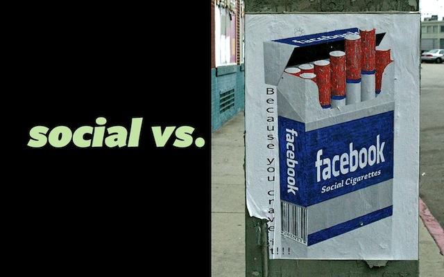
First, the social-media companies really push the idea that they’re more than just entertainment. They want you to invest your true self. Think about Facebook’s ridiculous insistence that you put in your real name, your real biographical details, and all that. This is usually cloaked in some rhetoric like “we want to make the world more open and connected.” You know this is bullshit, right?
No, really. You have to remember—these are advertising businesses. All of them. And what they need to do—and I’m not saying this because they’re bad, it’s just what they do—they need to harvest your personal data so that they can turn around and resell it to advertisers. That is the essence of their business. So all this stuff about “open and connected”—whatever. That’s just marketing.
The second insidious quality of social media is that it’s expressively flat. It’s great for simple ideas like “Dude! That’s awesome!” or “Dude! That sucks!” But it’s really terrible for everything in between. And to me, that’s the most interesting and worthwhile part of human communication.
Because of this, social media tends to promote what we might call a lazy consensus. It rewards us for gathering positive reinforcement: Who liked me? Who retweeted me? But in most cases, we’d usually be better off seeking out thoughtful criticism of our ideas, not just compliments.
So all that said, I don’t mean that social-media companies are evil. They’re just limited. And we should be mindful of their limitations. Mindful of the fact that they’re built on incentives that don’t produce meaningful social value. They’re like Diet Coke. It doesn’t have any nutritional value. Not because Diet Coke is evil. There’s just nothing in it that would make it nutritious.
But don’t worry too much about Facebook and Twitter and so on—in the long term, they’re just going to be fruit flies on the banana tree of civilization. But they start us thinking about this notion of substance vs. emptiness in the social sphere. And this flows back to what makes typography valuable.
People often ask me what I like about typography—because I have a book about typography, I still design typefaces, and I go lots of places talking about typography. So when people say “What do you like about it, Butterick?” I say, “Typography has been responsible for almost all the good things that have ever happened to me.” Which is true. But it’s also not a satisfying answer to the question, because it seems vague and subjective.
Because what do people usually think typography is about? Well, how about this?
Have you ever heard this before? “Make it pretty”? I think that if you’ve ever told anyone what you do in school, or what you do for a living, or if you’ve ever had friends, if you’ve ever had parents, if you’ve ever had clients—then you’ve heard “make it pretty.” Or some variation of it—like “make it look good.”
When people say to me “Isn’t that what typography is about? Making it pretty?”—I cringe a little bit. It sounds wrong. But on the other hand, that’s not really fair, because as designers, we do want things to look good, usually. We don’t want them to look bad.
So what’s the problem with “make it pretty”? The problem is that making it pretty is the lowest form of typography. It’s just the tip of the proverbial iceberg. There’s more below the waterline, is what I want to say to these people.
But what is that? How do we define that?
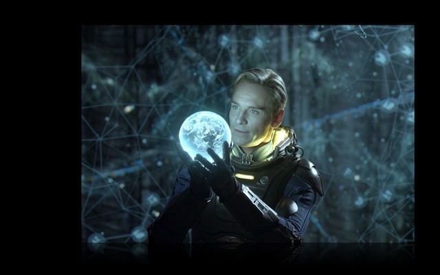
I was thinking recently, as I often do, about the world’s best-looking actor: Michael Fassbender. I mean, that is a good-looking man. I’m from Hollywood, so I know that a lot of actors are good-looking. It’s helpful in that line of work. These guys are going to be on screen for a couple hours. We want them to be easy on the eyes. But I also know—again, being from Hollywood—that not all good-looking people are good actors. So think about Michael Fassbender. He attracts our attention by being good-looking. But that’s not what makes his performances persuasive. So it’s a little like typography, this problem. He’s doing more than just being good-looking.
In thinking about this, I had two moments of insight.
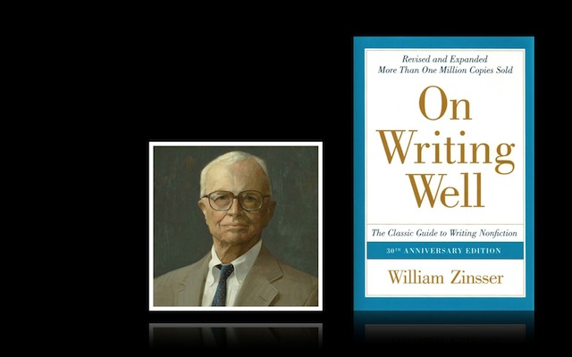
The first one came when I discovered an author named William Zinsser. I’m not going to be talking about typography for the next 45 seconds; I’m going to be talking about writing. This guy William Zinsser—a wonderful writer, and he’s written many books, all of them about writing. But this is his most famous one, called On Writing Well.
Zinsser’s thesis is that writing should be an expression of our humanity. And he doesn’t mean that in a goofy, age-of-aquarius way. He means something very concrete and simple, which is that the best writing embodies the best human values. And he names four: clarity, simplicity, personality, and warmth. It’s a nice idea.
Zinsser also has something to say about how we become good writers. He’s almost saying that we’re not really learning good habits so much as we’re unlearning bad habits. Because expressing ourselves with clarity and simplicity ought to be easy. Kids can do it. So at some point, we know how to do it. It’s just that as adults, we internalize all these cultural incentives to stop expressing ourselves clearly.
To give you an example: are you familiar with this company that makes a device called the BlackBerry? It’s called Research in Motion. Well, a few months ago, Research in Motion didn’t have such a great quarter financially, and they put out this long press release, including this sentence, which I’m going to try to read without dying:
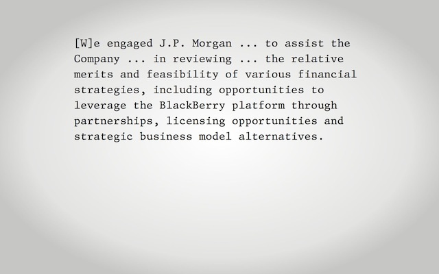
Do you know what this means?
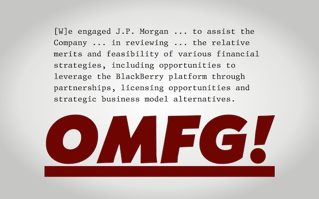
They’re saying they’re screwed! And the funny thing is, when companies put out press releases that talk about “strategic business model alternatives,” that’s how everyone in the financial industry interprets it—“Hey, you just admitted you’re screwed.” But they can’t come out and say it. So it’s funny that even though no one’s being fooled, we still need this layer of code and indirection in the writing.
And why is that? Why do we want this? That’s such an interesting question.
I think it has something to do with this other great human motivator: fear. We’re not chimps anymore, living in the rain forest, fearful about getting eaten by a leopard or a python. But we still have social fears. We have the fear that we’re going to be exposed as an idiot. That people won’t like us anymore. That we’ll be cast out of our social environment. So sometimes, we prefer the safety of indirect nonsense like this to the risks of honest communication.
As I was thinking about this, I felt like, wow—this analogizes to design really well. Because think about a fearful, insecure designer. How do they go about their work? Usually they’re trying to fill space, put more things on the page, follow templates, put in the clip art. For that designer, design is a tool for adornment, decoration, and complexity. Whereas a confident designer doesn’t care about all that. For the confident designer, design is a way of taking mundane objects and instilling them with these great human values that Zinsser was talking about: the simplicity, the personality, the warmth.
It’s right about here that I had my first moment of insight, which is this: typography and writing are obviously different formally, and in how they work. But they’re not that different in what they do. They actually grow out of a common root of human expression, because they’re both targeting these same great core human values.
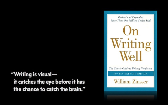
Zinsser’s book even has a great line that sums this up: “Writing is visual—it catches the eye before it has the chance to catch the brain.” Yeah, of course. We all know this. But it’s such a great, simple summary. Writing is visual. There it is. Both the text and the typography are working toward this one goal.
To go back to that proverbial typography iceberg. Okay, maybe above the waterline, we are “making it pretty.” I can live with that. But below the waterline, what are we doing? We’re making it more meaningful. Typography adds meaning. And it merges with the text to bring out the full potential of the text—to bring out that simplicity, warmth, and humanity. That’s what typography can do.
So I reach this point and I can’t help mentioning the famous Crystal Goblet essay, by our friend Beatrice Warde. Do students still read this? You’ve heard of this.
Here’s my problem: the more I know about typography, the less sense this essay makes. Because Warde starts with this dubious central metaphor: the wine is the text, and the glass is the typography. I get it.
But then she says “printing should be invisible.” I understand she doesn’t mean that literally. But even on a metaphorical level, I’m still not clear what she’s getting at.
I tried thinking of her metaphor as a perceptual argument: that somehow, typography shouldn’t negatively affect the appearance of the text, or its legibility. But in that case, this metaphor really makes no sense, because wine without a goblet is still visible. Right? It’s got a visual reality. It’s just a puddle on the floor, because it’s not in a goblet. But you can see it. And that’s different from words without typography. Words don’t exist in the visual realm until typography shows them to us. And the metaphor breaks down.
So I thought, okay, that can’t be what she means. So I tried thinking of this crystal-goblet metaphor as a semantic argument: what Warde is saying is that typography should be suitable for the text. It should be appropriate. And that’s fine, as far as it goes.
But that, to me, is not invisibility. That’s asking typography to do real expressive work. To do its job. Writing is visual. Typography reinforces the meaning of the text by having its own meaning. By adding meaning. So the written word ends up being a merger of the visual and the semantic. And for me, that’s why this metaphor of wine in a crystal goblet ends up being really misleading.
I won’t spend my whole day trampling the memory of good old Beatrice Warde. Let’s move on to the second moment of insight.
In Los Angeles, we have a printing museum with a big letterpress shop in the back. I was working there a couple months ago. I took a break in their library of type specimens.
I pulled down one I’d never seen—the one on the bottom of this photo—it’s a Stempel foundry catalog from the 1920s. I just want to show you some pages from this. If you ever have a chance to spend some time with this catalog, you should, because it’s pretty amazing.
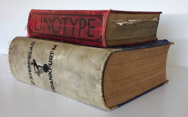
This is a photo of the Stempel catalog on the bottom. That’s the famous Linotype red book—a lot of people have seen that—on the top. Obviously, the Stempel book is enormous. It’s well over a thousand pages.
Every page is just extraordinary, because each one is filled with these amazing examples of type design and printing. And what really impresses me about this is just the utter command of the medium that’s displayed on every page. It’s like Eddie Van Halen on the Fair Warning album. You can’t believe how much these people knew.
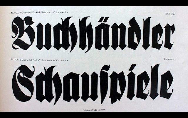
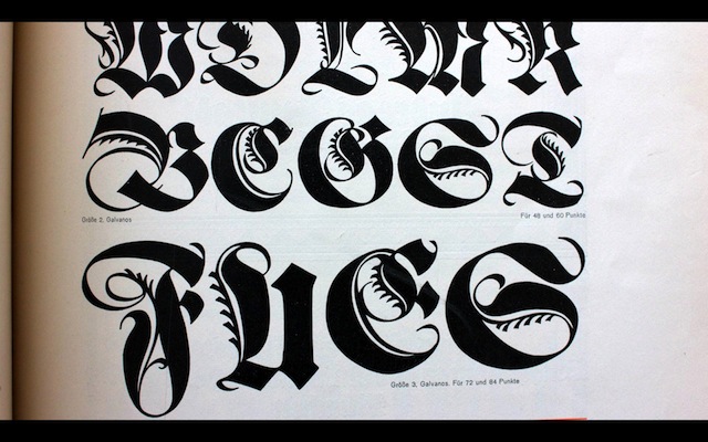

And these type designs—they’re a wonderful combination of exuberance and precision. These guys really knew what they were doing. Just extraordinary. You don’t see things like this anymore.
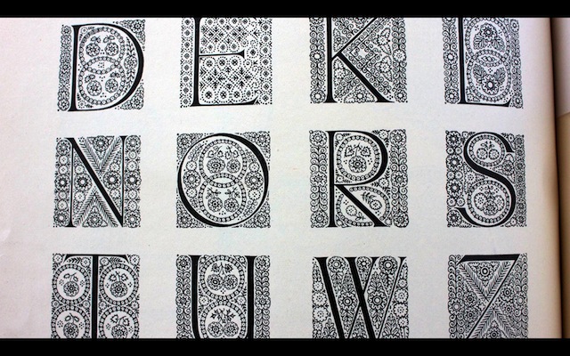
This is just showing off. I mean, this would be painful to make in digital. And somebody was sitting there, cutting this out of metal. Unbelievable.
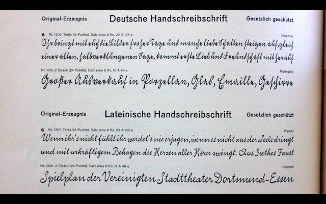
Handwriting fonts. Again, these are metal. Pieces of metal. You can’t even see any gaps between them. It’s beautiful.
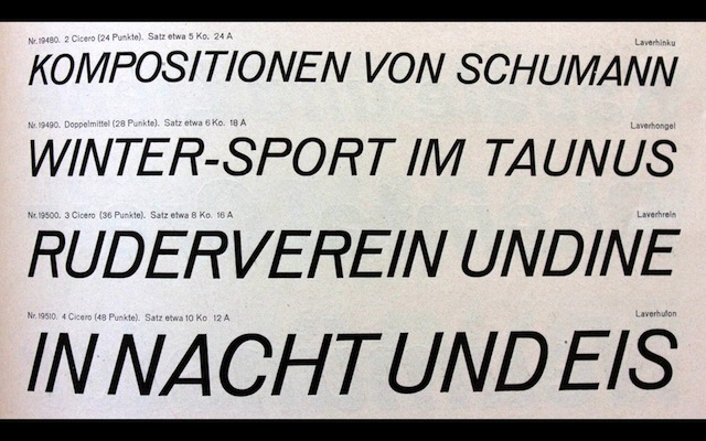
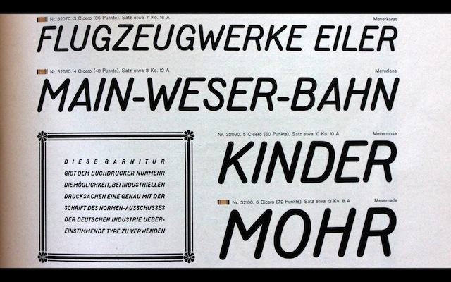
As you flip through, you’re also struck by how some of these just seem so madly contemporary. This could be next month’s FontFont release, for all I know.
Then you’ve got these great pages where they bring it all together, and they show you what you can really do with the type. Again, if you know even a little bit about letterpress printing, these pages are just gorgeous. Everything about them—the design, the color. It’s extraordinary.
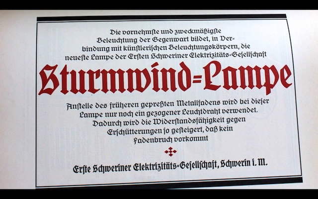
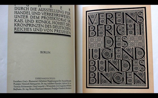

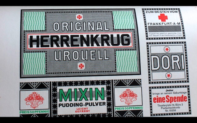
Just this page. You could set up a whole design practice today ripping off this one page. You’d be fine for 20 years.
So I’m going through this book, and as I said—there’s a thousand pages just like this. I’ve only shown you six or seven. And I have this Stonehenge moment: whoa, dude. I am in the presence of some kind of freaky alien intelligence from the 1920s. What message do they have for me? I want to listen up.
And the message is not that things were better in the 1920s. We know that’s not true. That’s the nostalgia fallacy. We always have to be mindful of this when we’re looking back at the history of typography. Because we’re only studying the good stuff. But in any era, 99.9% of everything was crap. Even in Germany. So you have to bear that in mind.
But the thing is, even Stempel wasn’t just selling type to the top 0.1%. So there’s this question—what were they selling?
And this is where my second moment of insight came. It’s that Stempel wasn’t really selling type. They were selling possibilities. I’m going to keep repeating that word so I won’t say it more than once right now. They were selling a standard of craft and imagination for customers to aspire to. This whole catalog is shouting out “Hey, look what we did with this type. And if you buy this type, maybe you can do something cool like this too.”
In practice, that wasn’t going to happen. Most of their customers weren’t going to be able to achieve what they achieved. It’s like those frozen dinners with the photo on the front that says “serving suggestion”—good luck getting it to look that delicious.
But it doesn’t matter. Because what this catalog is about is planting that seed in customers’ brains about what’s possible. And what a great spirit that is.
To go back to my earlier point—the point about Zinsser and the writing—I think this is also what we use writing for. Writing is the primary way that we store ideas in our typographic society. It’s the primary way we communicate possibilities to others, and plant new ideas in the heads of readers.
And here, I feel like we can start to see the golden thread that goes through the thousands of years of the typographic society—namely, this ongoing human project of discovering possibilities and sharing them with the next people in line. And this project produces a virtuous cycle of creativity and progress. And typography and writing are both woven into this golden thread. Though typography is often characterized as being in the service of the text, I prefer to see both typography and the text as serving this broader social project.
And that brings us to the idea of rebuilding the typographic society.
When I talk about “rebuilding,” am I saying that everything was great, and then it got broken, and now everything’s broken? No. I’m saying something milder, which is this: as designers, we’re always in a struggle between possibilities, on the one hand, and the opposite of possibility. I’ll contend that the opposite of possibility is not impossibility. Rather, possibility carries with it the notion of progress and evolution. So the opposite of possibility is inertia. Those are the opposites that we struggle with. We’re dealing with the tension between the world as we hope it could be, and the world as it is right now.
Everyone who’s creating or researching or discovering is out there helping explore possibilities. And that’s true whether you’re a writer, or a scientist—or a designer. I really dislike this idea that design should be a service industry that solves problems. That really undersells what designers are capable of, and what designers can contribute. Solving problems is the lowest form of design. Investing your humanity is the highest.
So we’re engaged in this struggle. As part of that, we’re always destroying parts of the typographic society, and rebuilding. That’s normal. That’s healthy. That’s the usual renewal.
But now and then there’s a bigger event—let’s call it a Godzilla moment—that causes a lot of destruction. And what is the Godzilla? Usually the Godzilla is technology. Technology arrives, and it wants to displace us—take over something that we were doing. That’s okay when technology removes a burden or an annoyance.
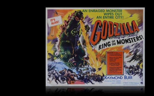
But sometimes, when technology does that, it can constrict the space we have for expressing our humanity. Then, we have to look for new outlets for ourselves, or what happens? What happens is that this zone of humanity keeps getting smaller. Technology invites us to accept those smaller boundaries, because it’s convenient. It’s relaxing. But if we do that long enough, what’s going to happen is we’re going to stagnate. We’re going to forget what we’re capable of, because we’re just playing in this really tiny territory.
The good news is that when Godzilla burns down the city with his fiery breath, we have space to rebuild. There’s an opportunity for us. But we can’t be lazy about it.
The Godzilla of the ’80s—maybe some of you remember—was the Macintosh. In desktop publishing, the Macintosh destroyed a lot of typography and layout businesses. But it also introduced a new opportunity for exploration.
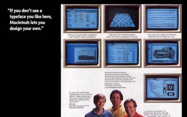
That was actually part of the marketing of the Mac from the very beginning. You can’t see the caption in the upper right, but it’s a picture of the various fonts on the Macintosh, and it says “If you don’t see a typeface you like here, Macintosh lets you design your own.” (You recognize that good-looking guy in the lower left? That’s Bill Gates.)
This is a great ad. And it’s a little bit like the Stempel catalog in that it’s selling possibilities. That’s what it’s putting out there. And it’s doubly funny because if you had an old Mac, you remember that it really didn’t do that much, even though it was really cool. But it was inviting you to figure that out. It was inviting you to participate in this exploration.
Then we had the Godzilla of the ’90s—the web. You remember that. Like the Macintosh, the web is a largely typographic technology. But it’s followed a different path. We had an initial burst of excitement, but now, it feels like we’re in a rut. We’ve had the web for less than 20 years. So we should be in the incunabula age, where we’re exploding with creativity and craftsmanship. Instead, even those that you’d expect to be in the top 1% of design leadership are aiming for the lowest common denominator.
As an example, I’d like to show you some newspaper websites. I pick on newspaper websites justifiably, I think, because these newspapers are some of the best-designed publications in the world. You’ve seen them. So we know they have design standards. They have a design staff. They have a design budget. All that’s good.
But what do we see when we go onto the web? Awful, awful, awfulness.

Here’s the Los Angeles Times. Pretty bad, right.

Here’s the San Francisco Chronicle. These are not dinky papers. These are major American cities.

Here’s the Washington Post. What I also want you to notice is that not only are all these websites awful, they’re all awful in exactly the same way. You’ve got the little cluttered toolbar at the top. You’ve got the big logo in the upper left. You’ve got the article in the left column. You’ve got all the little links and ads in the right column. They’re all the same.

The New York Times. Awful, in exactly the same way.

And this is not only an American disease. There’s the Guardian. Same layout.

Le Monde. The same. Also awful.

And Die Zeit—I’m sorry to say, exactly the same. And also awful.
What’s going on here? Isn’t this weird? You could trace it to a few causes. One cause is surely just general lack of ambition and following the herd. That’s true.
But I think what we’re also seeing is that there’s creative energy that’s leaking out of the web due to some faulty technology at the core of the web. And that technology is web standards. I know that might sound strange, but hold on a second. Because if you’ve done anything on the web, it’s axiomatic that web standards are good, that web standards are your friend. But before too long, you notice that there’s this gap between theory and reality.
Because how should a good technology standard ideally behave? What a technology standard should do is take an ugly problem and say “Look, here’s one great way to do this, and we’ll all benefit if we rely on the standard to handle this.” So the deal is that you give up some control in exchange for consistency and reliability.
But in the last 18 years, web standards haven’t really performed that way. A few of them have. But as a whole, they haven’t. And why is that?
For one thing, most of what we call web standards are really just recommendations. There’s no requirement that anyone implement them.
Number two is that there’s no reference implementation for these so-called web standards. So they’re not really “standard” at all. Browser makers can implement them with a fair degree of variation.
The third problem is that these standards aren’t run by an individual or a small group of individuals. They’re run by the W3C, which is this large, bureaucratic organization. And that would be a nice description of it.
So on the web, the problem is that we’ve ended up with the costs and overhead of technology standards, but without most of the benefits.
This leaves us with a really unappealing choice. Either we stay anchored to the lowest common denominator, which is where the standards work well. And I feel like this is what you’re seeing with these newspaper layouts. That’s a layout that actually works well under the web-standards view of the world. So we can do this. Or we can waste our time and energy plugging all the holes that the faulty standards were supposed to fill.
Either way, we lose, because we’re not getting to explore the possibilities of the web the way we should. Ultimately, web standards punish everyone who aspires to excellence.
Moving on to the Godzilla of the last 10 years: digital books. Digital books involve some of the most consequential design issues of our era. But so far, we’ve left almost all these decisions to two billionaires.
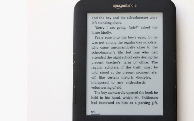
Billionaire #1 is Jeff Bezos of Amazon. This is an Amazon Kindle. Some are bothered that Jeff Bezos has predicted the end of the printed book. I’m not really bothered by that. In the long term, I think he’s right. It is inevitable. What bothers me is that he wants to replace printed books with something really shitty, which is this—the Kindle.
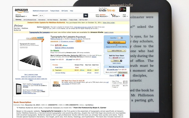
But with Jeff Bezos, what did we expect? He’s been showing us the Amazon website for 15 years. This is his idea of good design. Didn’t we see this coming? The Kindle is just the next step in Amazon tastelessness.
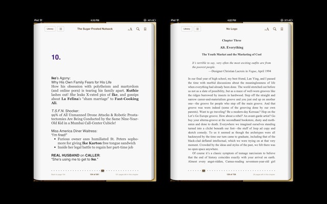
Billionaire #2 is the late Steve Jobs, of Apple. This is the iBooks app, on the iPad. I don’t know exactly how Steve Jobs was involved with this. But we know two things. We know that Steve Jobs was involved in every design detail of the iPad. We also know that in general, he foresaw that the digital-books market was going to be big for Apple. So we’d expect iBooks to be really great. Right?
But it’s not. In fact, it’s easily the worst Apple-made software on the iPad. What’s the problem? Well, the iPad is a great piece of hardware. You’ve got the touchscreen, the high resolution, you’ve got the network, color, all this stuff. But iBooks only uses a tiny sliver of that capacity. And it offers very limited options for writers and book designers. There’s this whole attitude beneath iBooks, which seems to say “Hey buddy, take it or leave it.” It’s completely the opposite of that original Macintosh ad we saw just a second ago.
As I say all this, let me counterbalance it by saying that I don’t think Apple and Amazon are evil, any more than Facebook and Twitter are evil. They’re economic entities. They go where the money is. They’re not human beings.
But readers and writers and designers are human beings. And that’s why it’s troubling that we’re putting up with this. We shouldn’t. We know better. We know that books are the core artifacts of the typographic society. We know we’re going to have digital books. So this isn’t a battle for paper. It’s a battle for quality. It’s a battle for higher standards. It’s a battle to preserve those human values that are an essential ingredient in both great writing and great design—the clarity, the personality, the warmth I was talking about. If you like those values, you can’t just sign on to this Apple and Amazon agenda. Because if we do that, we’re going to lose all the possibilities of paper, while gaining nothing.
All right. Let’s close with a few concrete suggestions for what you can do to help rebuild the typographic society. In reverse order from four to one.
Number four: sell possibilities. I’ve already talked about this a lot. Both words are important. Possibilities—if you take the possibilities out of your work, you’re taking out the humanity. Then you’re just left with the service of making things pretty. I think that’s boring. And I think if that’s our job, we might as well just set everything in Frutiger, make it blue, send the client an invoice, and that’s it. That’s easy. But that’s boring. We can do more. We can expect more.
And the selling part is important too. I think this is really at the core of what clients can be enticed to pay for. You should see it as a core value of the design work, not something that happens on the edges.
Number three: recruit typographers. I love FontShop, I love the TYPO conferences, and I know you’re all big typographers. But I have some really bad news. Did you know that nobody really knows that fonts exist? I’m not talking about your parents. I’m not talking about your brothers and sisters. I’m talking about most professional designers. They don’t know that fonts exist. I mean, fonts that are not already installed on their machines. If you don’t believe me, walk down the street of any major city, walk to the newsstand, turn on the TV—you’ll see all sorts of materials that could only have been made by a professional designer, but they’re completely awful.
So you have to spread the word. You’re here, and it’s fun to be here. But don’t always sequester yourself among like-minded enthusiasts. Get out there and spread the good word about typography. Teach other people about it. Write about it. Bring in more recruits. Because they need to know about this great stuff.
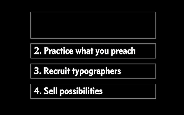
Number two: practice what you preach. We’ve all heard this. It also applies to being a designer, because making things is just one part of being a designer. You still need to be careful, in the other parts of your career, not to undermine your work with mixed signals.
I hope that some people in the audience will see this as the gentle but deserved picking-on that it is. Do you know that there are companies out there that sell webfonts, but that don’t actually use them on their websites? That’s funny, right? That they’re telling customers they ought to use webfonts, but not actually doing so themselves. I don’t want to name any names, because that would be rude.
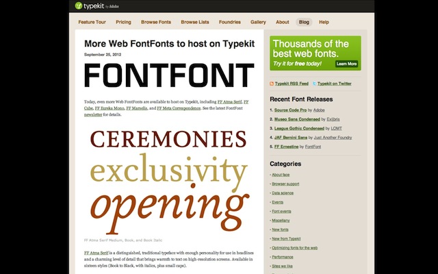
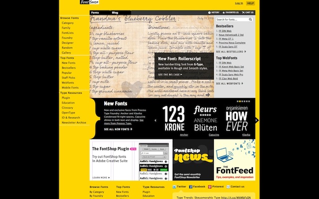
But I made a list before I came to London. I found about 12 companies like this. It’s one thing to talk the talk. It’s another thing to walk the walk. If we don’t lead by example, and customers don’t end up using webfonts, then we really shouldn’t be surprised.
Finally—sometimes, I hear conference speakers wrap up with a message like “… and the most important thing is to follow your bliss. The end.” It always bothers me. And I was thinking, why?
Because it’s terrible advice for designers! It’s terrible because “follow your bliss”—whoever invented that has got to go—it’s an invitation to indulge whatever’s in your brain now. Which means that bliss is really just an invitation to inertia. And we already saw that inertia is the enemy of possibility. So why would you want to follow your bliss?
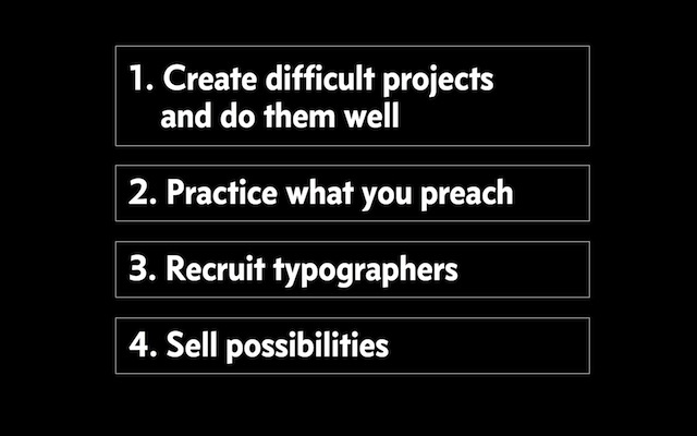
Let me make a different suggestion, which is this: create difficult projects and do them well. I pass this along because this idea has been at the core of every worthwhile thing I’ve ever learned.
By “difficult projects” I mean just what you think. Don’t repeat yourself with easy stuff. Raise expectations for yourself.
By “create,” I think that’s a better word than “find difficult projects.” A lot of times, there’s a difficult project lurking inside a project that otherwise looks easy. We have to challenge ourselves to see the potential and the subtlety in a project and go for the depth.
And then “doing it well”—obviously, keep your standards high. Use every project as a chance to learn at least one new thing.
This prescription means enduring a certain amount of struggle and discomfort. It’s not bliss. But it certainly makes for better work.
And we need it. Because these Godzilla moments I’ve been talking about—like the web, and the digital books—these are a call to action for design thinkers. We all have to answer the call. Because technology is a one-way ratchet. What we lose to technology, we’re going to lose forever.

Think about the Stempel catalog again. Not for nostalgia. Not even for the typography per se. But for the principle it stands for. Typography has always offered the possibility of a better future. If we don’t explore that possibility, and the future ends up more limited than the past, we’re going to have no one to blame but ourselves.
Thank you.
⁂